the last question
Driving display concepts
A driving-assistance display has to tell the driver when something needs their attention, without becoming another thing they have to keep watching. For the comma design challenge, I explored how openpilot could communicate its confidence and its proximity to the car’s steering, braking and acceleration limits.
The work moved from system sketches and information architecture to widget studies, screen layouts, hardware mockups and sound proposals. This is a design exploration, not a shipped interface or a validated warning system.
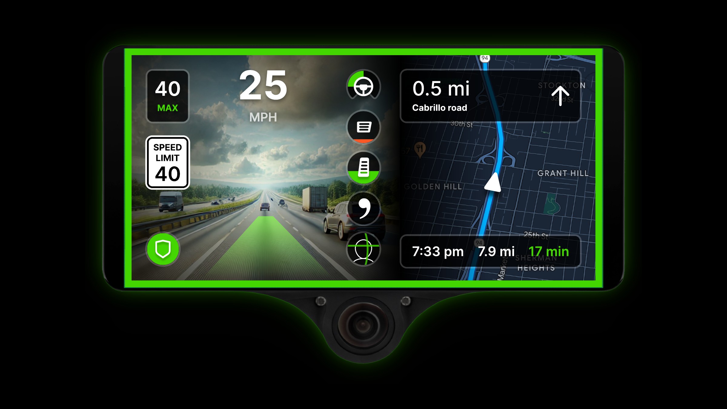
The proposed interface on the comma hardware: camera view, navigation and a compact column of system indicators.
The problem: an alert that arrives too late
The original challenge describes a steering alert that arrives after available torque is exhausted and the car begins departing from its intended trajectory. The driver needs an earlier indication of trouble.
The brief asks for two kinds of information: driving confidence, and proximity to vehicle-specific steering, braking and acceleration limits. Its confidence spectrum ranges from infrequent disengagements—less than once per ten minutes—to situations likely to require intervention within seconds, with an uncertain middle band.
The interface also has practical constraints: a windshield-mounted device, a flat Qt UI, and permission to use sound. The challenge is not just to fit extra information on screen. It is to make that information useful before an urgent alert becomes necessary.
Starting with the driver, not the screen
I began by drawing the relationship between the human, comma, the car and the environment. When assistance is engaged, commands pass through comma to the car. The driver still observes what is happening and can intervene. When assistance is disengaged, the driver controls the car directly.
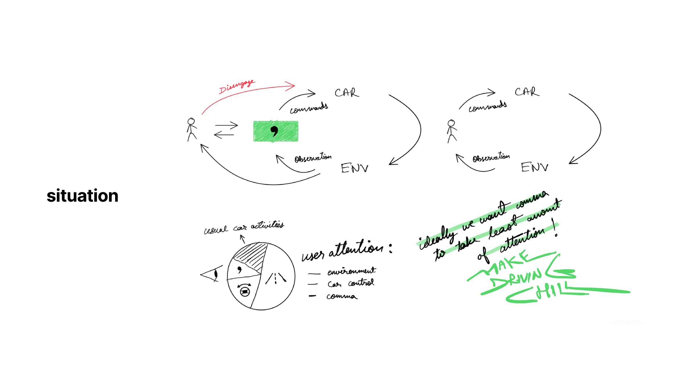
The control relationship above, and the driver’s competing demands for attention below.
That sketch gave the interface a supporting role. The driver already has to attend to the road and the car; understanding comma should not become a third continuous monitoring task. The display needs to communicate changes clearly, especially when the system is approaching a condition the driver must handle.
I also sketched the device in its actual surroundings: beneath the rear-view mirror, inside a windshield already framing the road. This made the device part of the car’s overall interface rather than an isolated rectangular canvas.
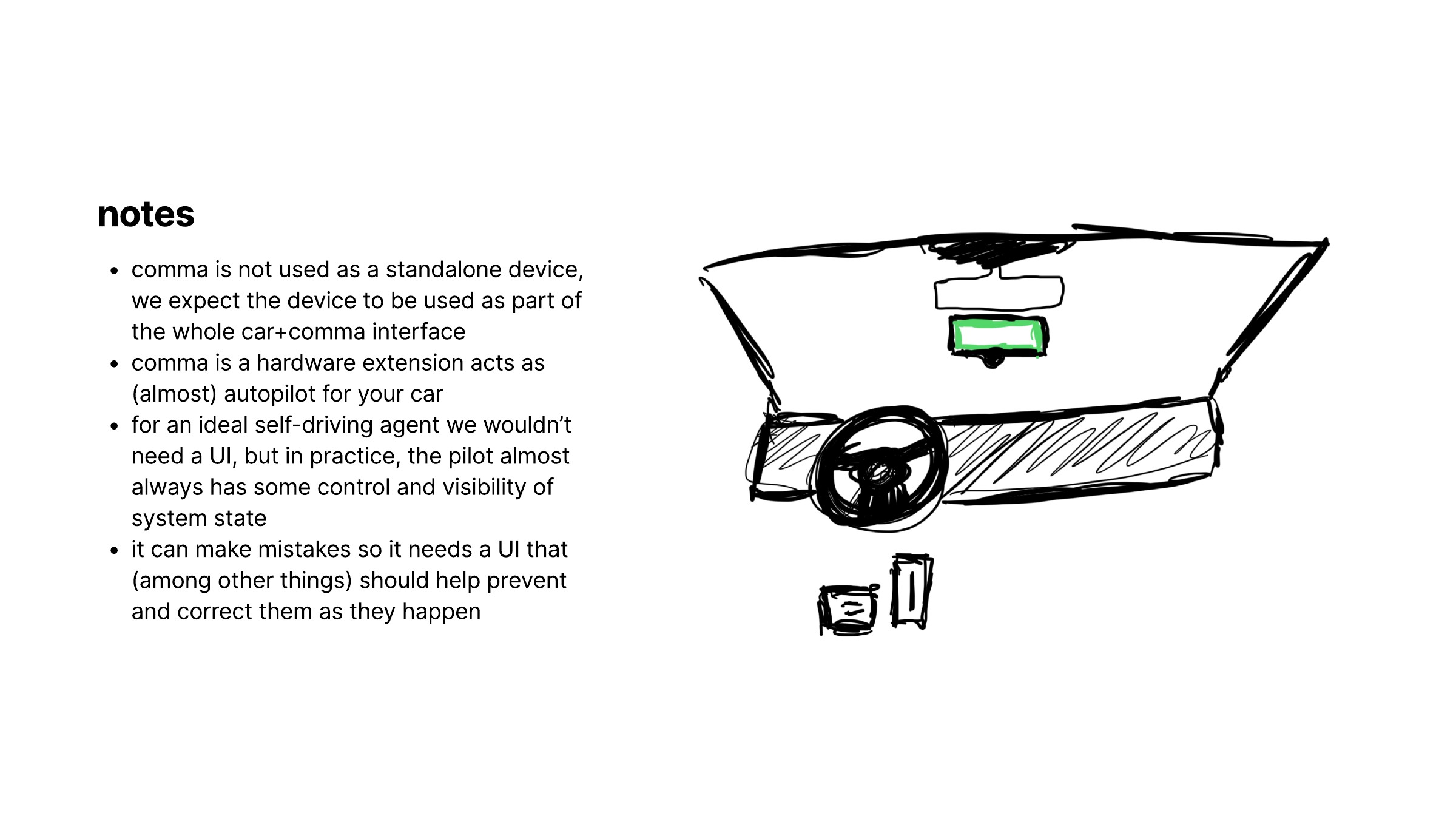
The road, instrument cluster, mirror and comma display all share the driver’s field of view.
Separating confidence from available control
Confidence and control limits are related, but they answer different questions. Confidence describes how reliably the system expects to handle a situation. A limit indicator describes how close a particular control is to the authority available in that car. A driver should not have to infer one solely from the other.
I used a tight turn to make the distinction concrete. In the sketch, one turn asks for steering torque within an illustrative limit; another asks for more than the system can apply. The second case creates a mismatch between the desired turn and the available control.
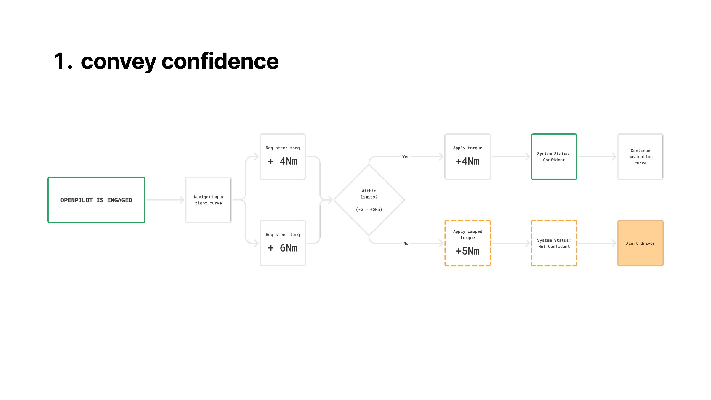
A simplified example using illustrative torque values, not specifications for a particular vehicle or a definition of openpilot’s confidence model.
The next sketch moved the warning earlier in that sequence. Instead of waiting for the maximum, it introduced an approaching-limit state, a more urgent state and then an alert at the limit. I initially marked these around 80%, 90% and 100% of available control.
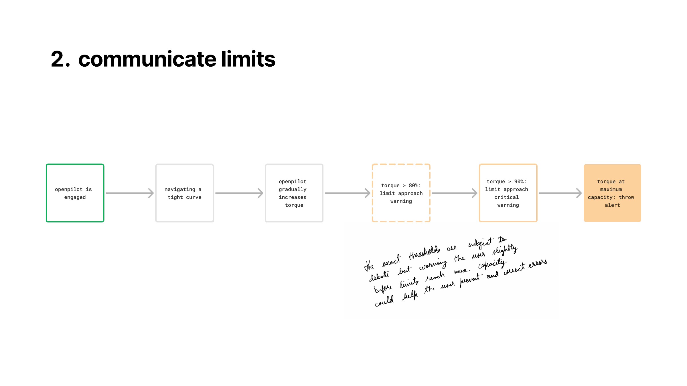
A proposed escalation before saturation. The sketch itself leaves the thresholds open to debate.
The useful design idea was the progression, not the exact percentages. Those thresholds would need engineering and human-factors validation; the diagrams were a way to reason about what the interface should communicate at each stage.
Understanding what was already on screen
Before adding anything, I annotated the existing interface. It already carried current speed, set speed, the speed limit, engagement state, driver monitoring, the camera image and path overlay, plus navigation instructions and trip information.
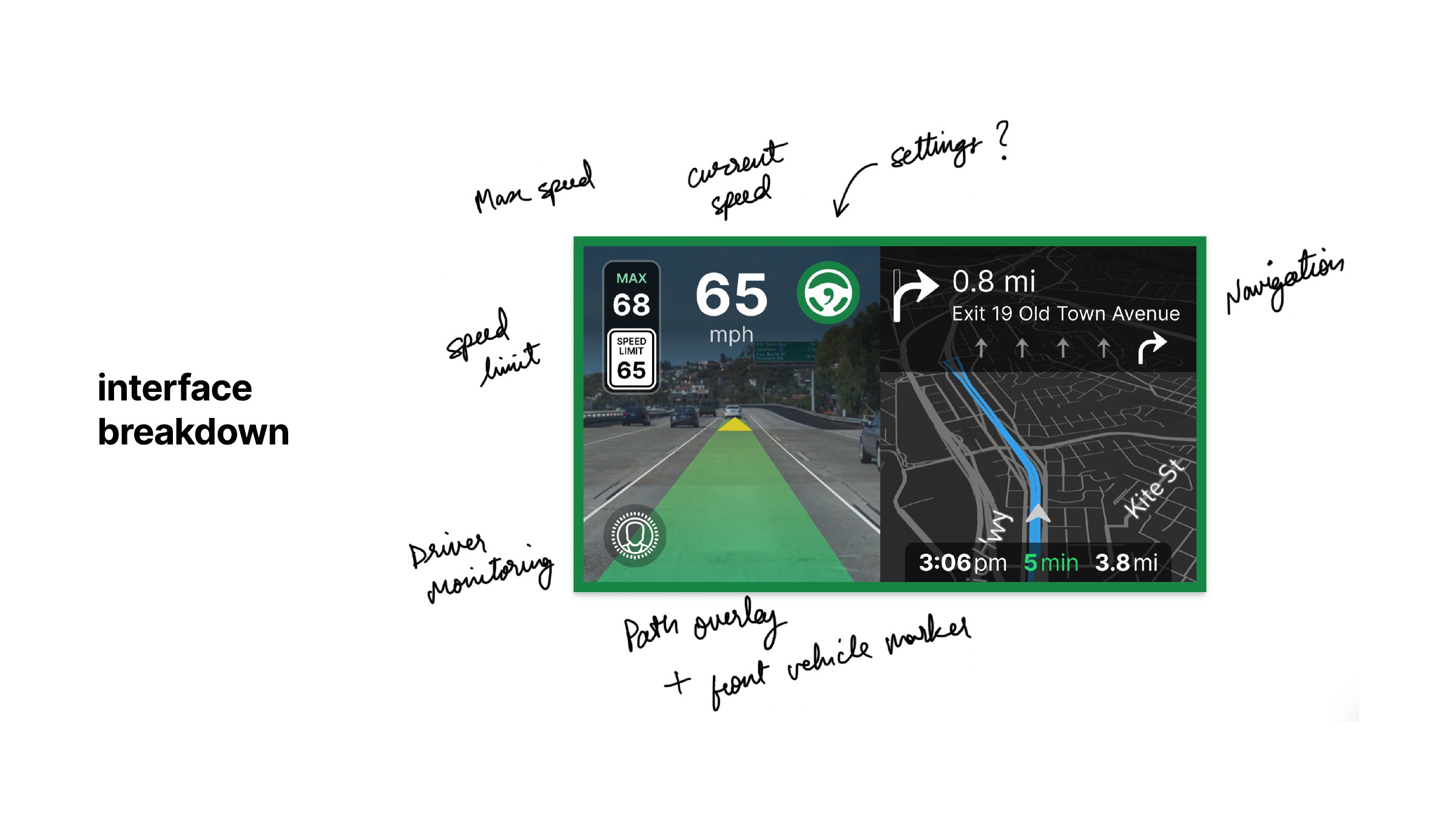
An inventory of the information already competing for space.
I mapped these into an information architecture with the camera and navigation as the main regions, and alerts and engagement as overarching states. Confidence and the three control limits were additions to that structure, not a separate dashboard that could assume unlimited space.
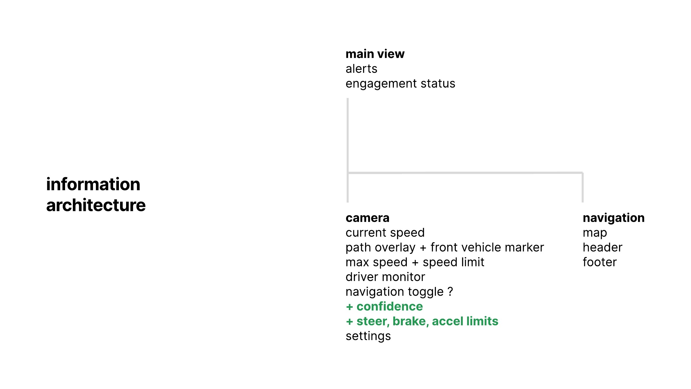
The existing structure, with proposed additions marked in green.
Trying many ways to show the same state
My first sketches put dials, arcs, bars and small groups of indicators around the camera image. Some collected the controls near the bottom; others placed them beside navigation or used a larger part of the frame to communicate state.
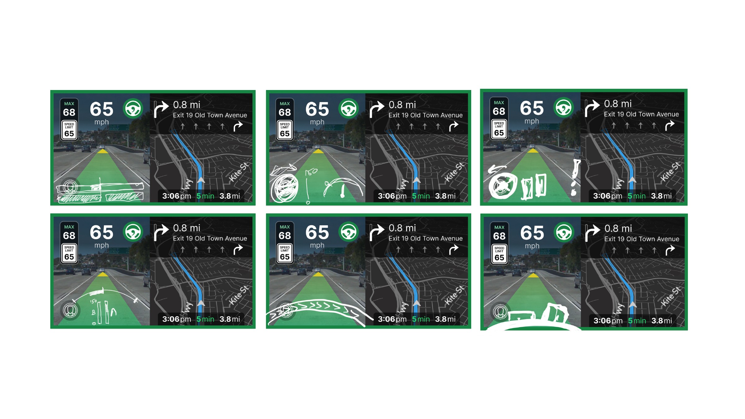
I then reduced the screen to wireframes. This let me compare placement and visual weight without the road image dominating each decision. I explored segmented confidence bars, broad arcs, compact steering-and-pedal groups, different speed positions and different uses of the screen perimeter.
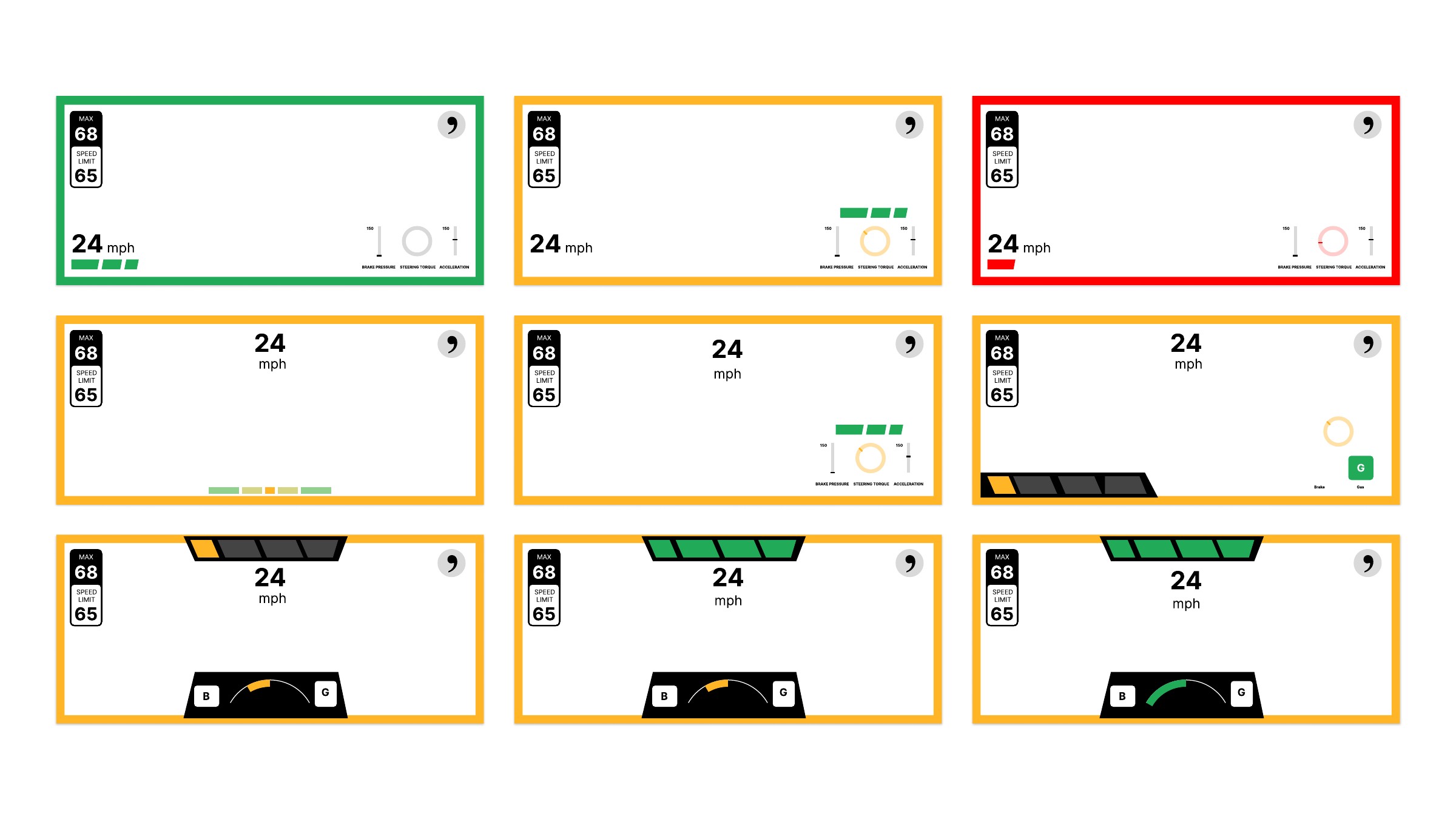
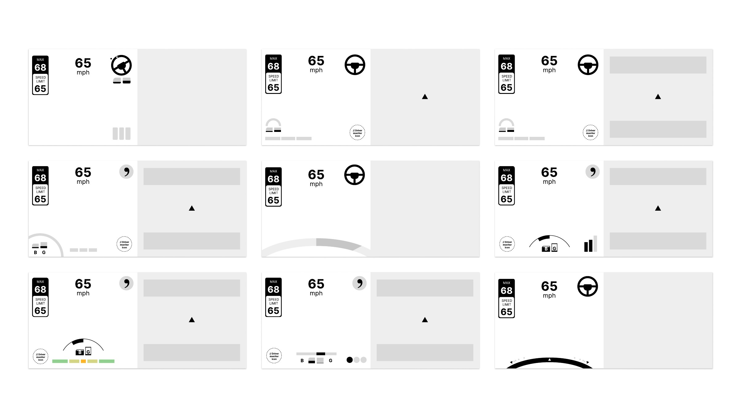
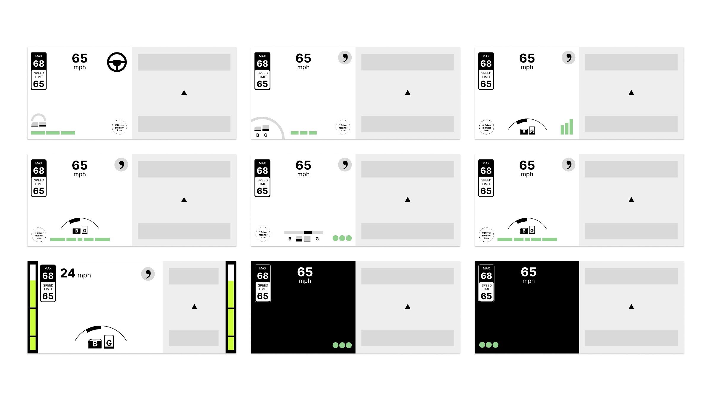
The complete wireframe boards. These are alternatives, not a sequence of production states.
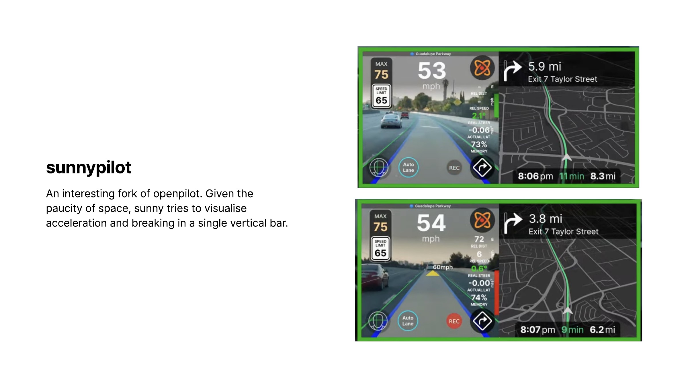
The sunnypilot screenshots in my reference material showed one response to the same space problem: combining acceleration and braking in a vertical indicator. They were useful as a comparison for how much telemetry could sit beside the camera view, and how much interpretation that telemetry still required.
I explored further combinations of numerical values, gauges and takeover messages. The larger board includes both ordinary operation and warning states, because a compact widget in a calm screen is only part of the problem. It also has to coexist with an alert.
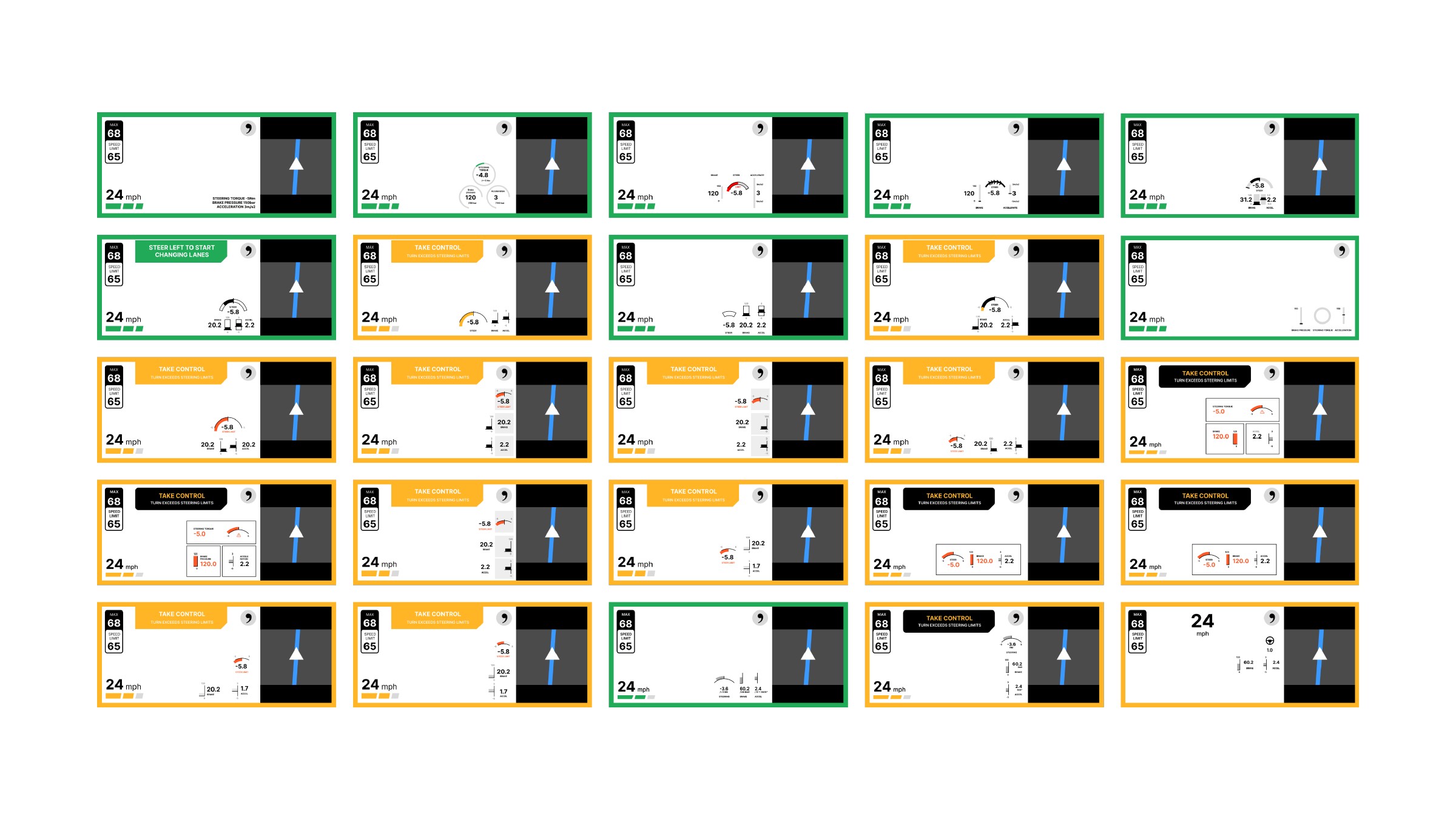
All 25 alternatives, including different indicator positions and takeover treatments.
A clear diagram is not necessarily a glanceable interface
The device would often sit outside the driver’s direct focus. I compared a sharp interface with a blurred version to think about what remained perceptible when the details disappeared: the border, the major regions and the broad distribution of light and color.
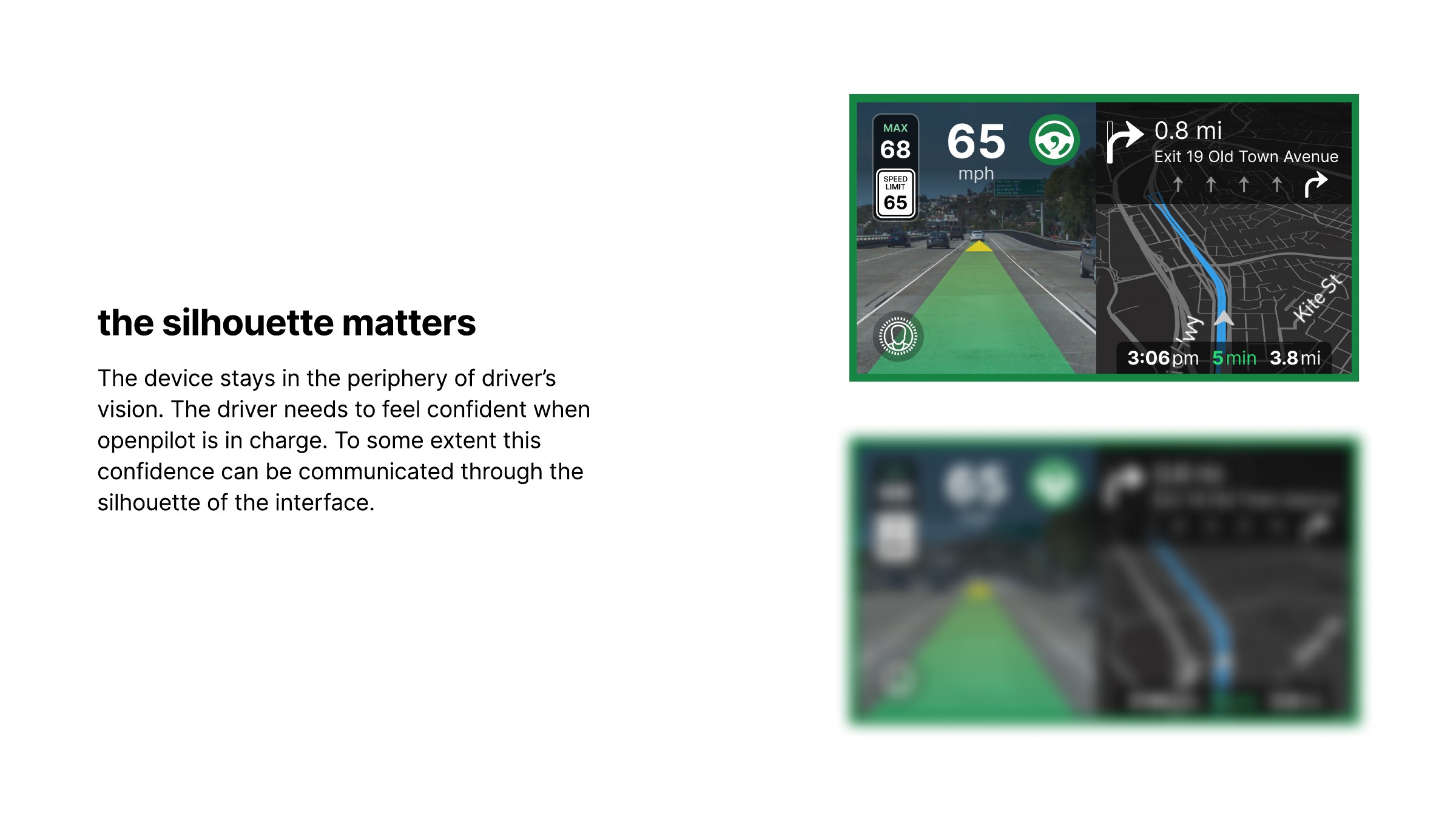
A visual exploration of the interface’s silhouette, not a measured peripheral-vision test.
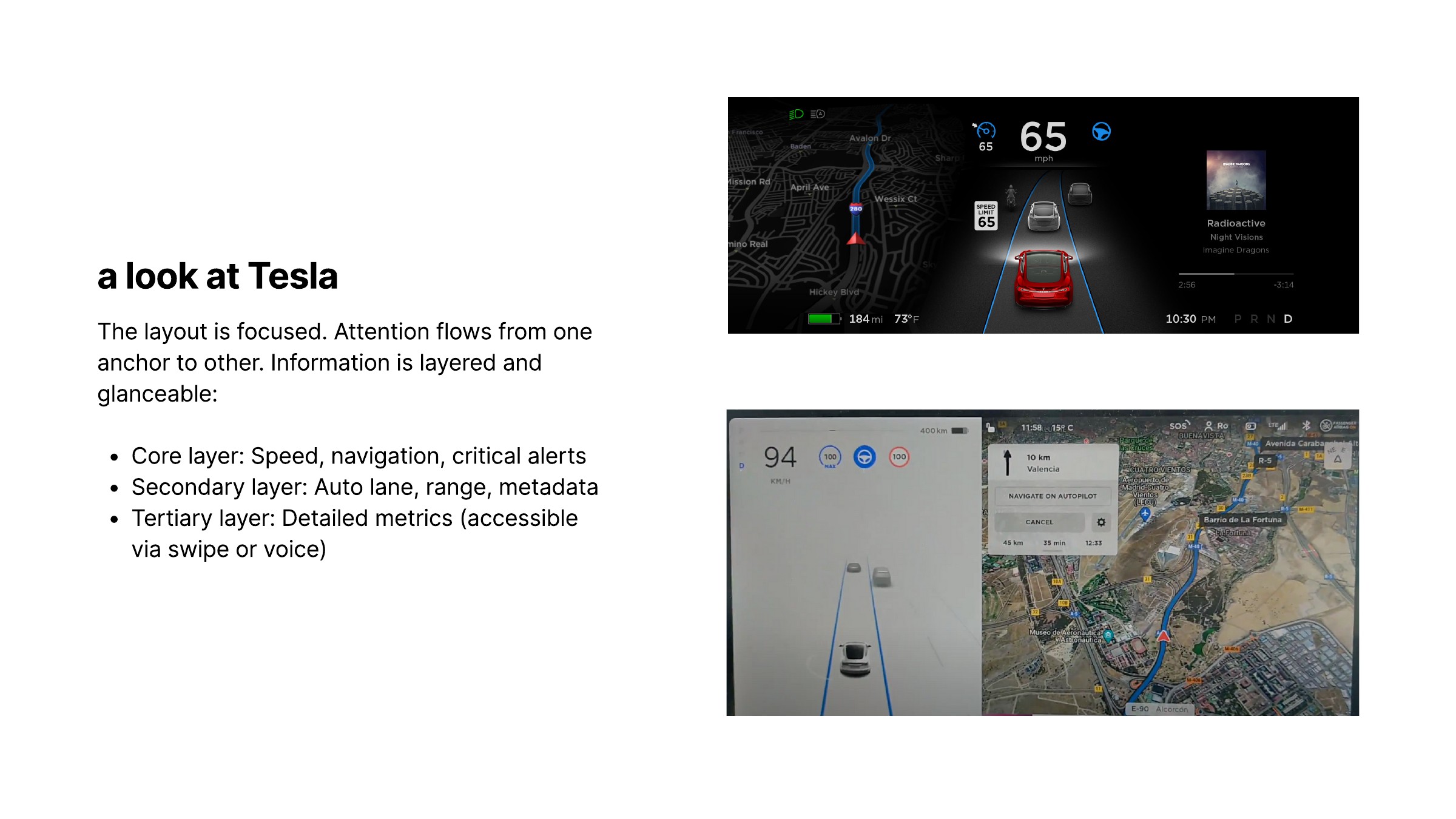
I also looked at the Tesla references collected in the deck. What interested me was their hierarchy: prominent speed and driving information, with other content grouped into secondary regions. I used those screenshots to think about stable visual anchors, rather than copying their layouts onto a much smaller device.
Returning to my own widgets, the problem became clearer. A steering gauge with a number, units and a scale could be easy to understand when studied in isolation, but still demand too much reading in the car. Adding similar detail for braking and acceleration multiplied that work.
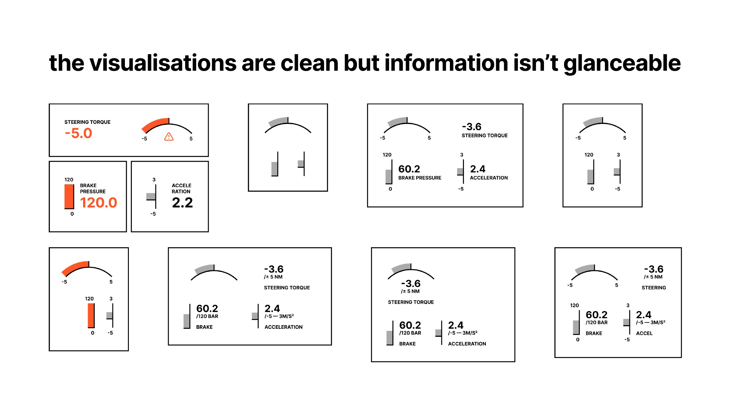
I explored more recognizable forms: a steering-wheel symbol, paired pedal-like shapes, simple fill levels and segmented bars. These studies asked whether the type of control and its changing state could be understood before reading a number.
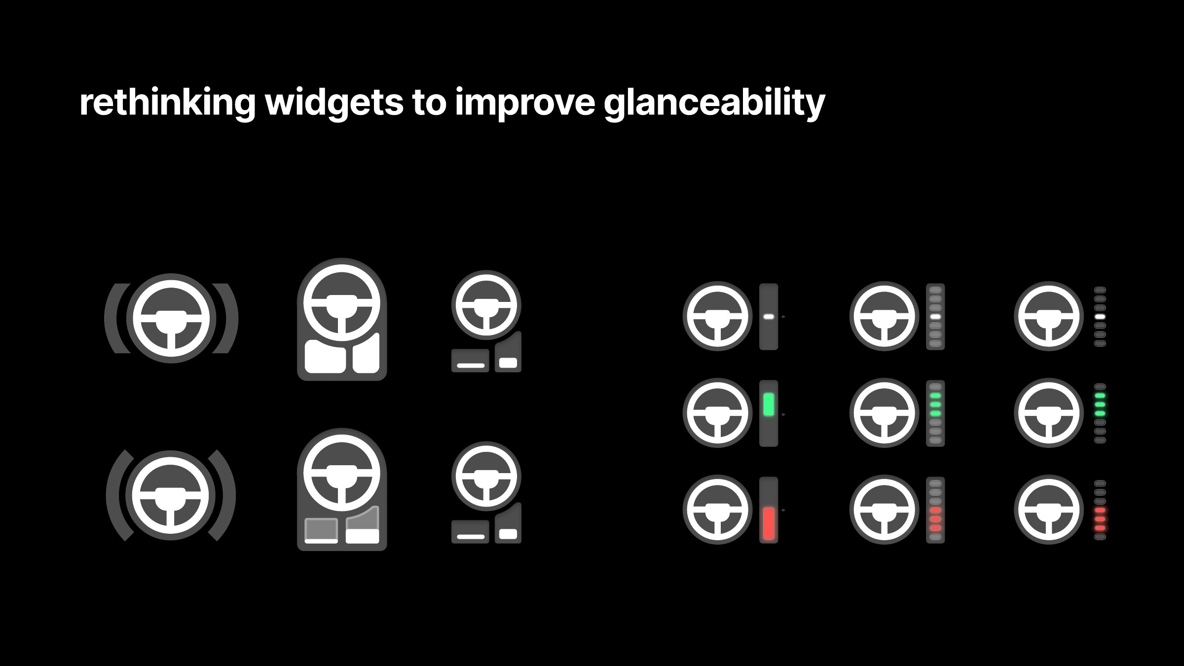
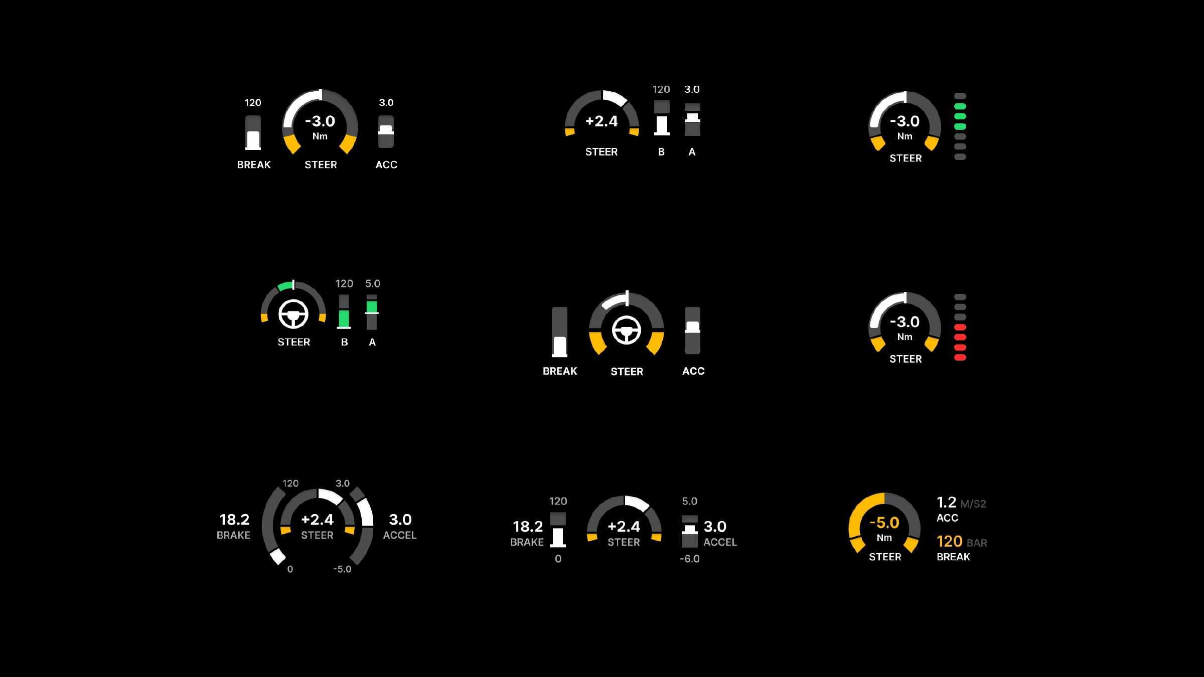
From labeled numerical instruments toward a more compact visual vocabulary. The boards preserve both directions and their intermediate variants.
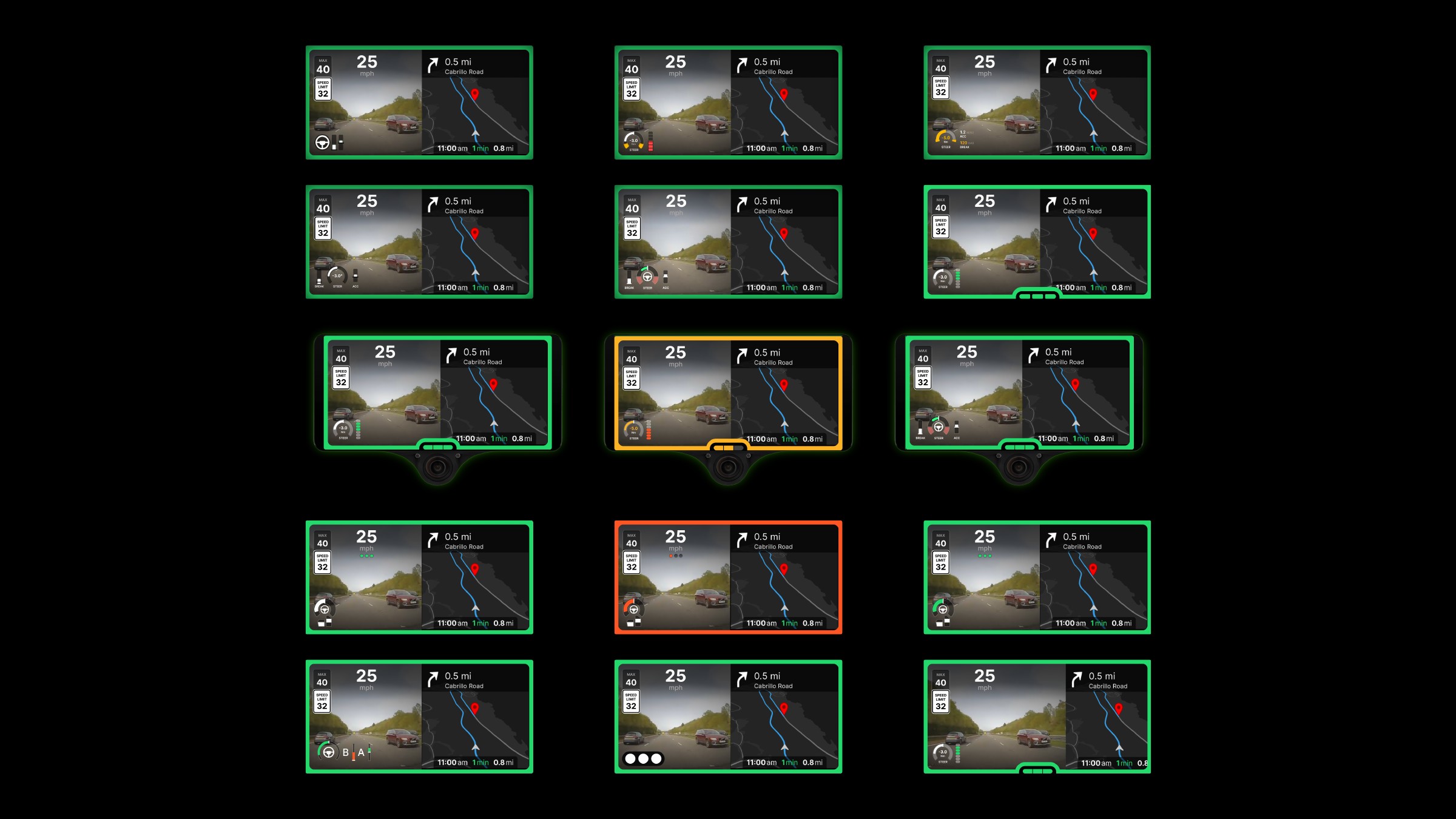
I placed the widgets back over road imagery and onto the hardware mockup. That exposed interactions the isolated studies could not: competition with the path overlay, visibility against changing scenery, and the relationship between status indicators and the device’s physical shape.
Making room without covering the road
The camera image was not empty background. I marked areas of the viewport to make that explicit, especially the lower road and path region where an additional widget could obscure useful information.
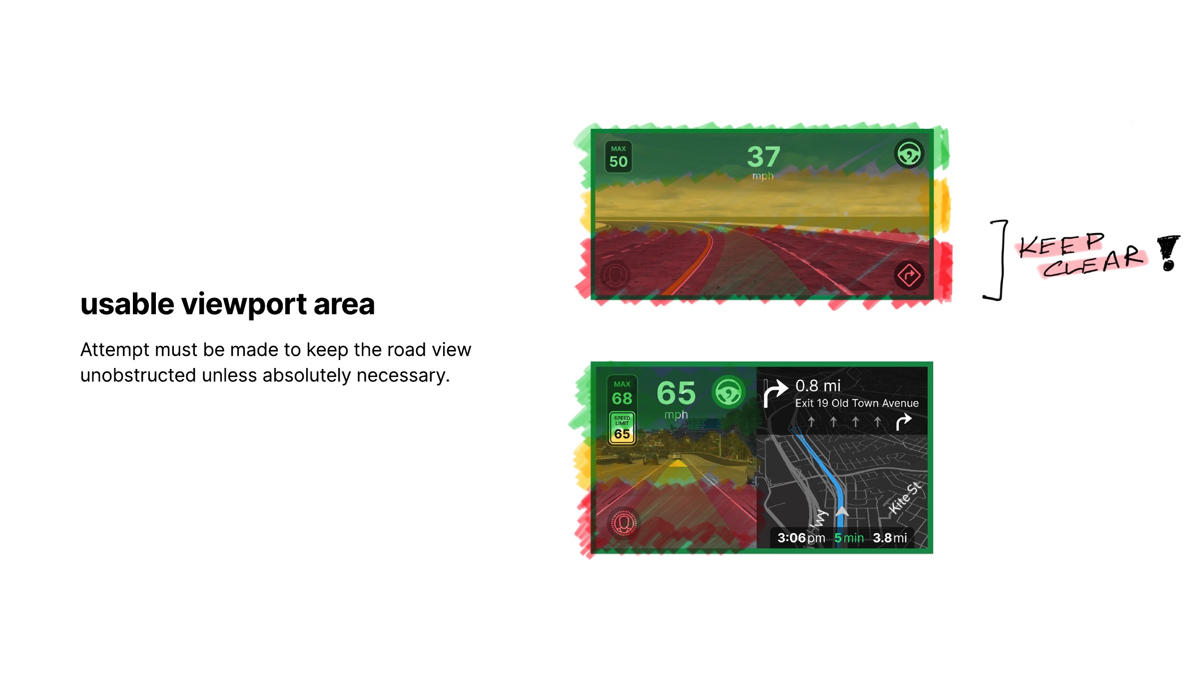
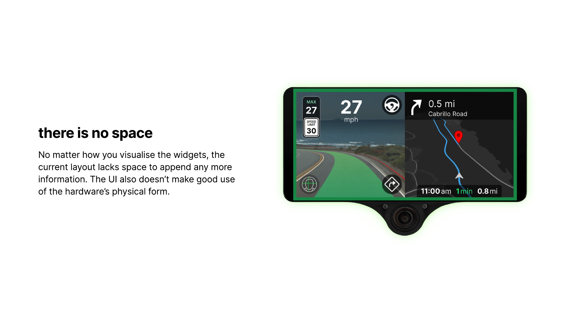
The existing split layout left little room to append more information. Smaller widgets alone were not enough; I needed to reconsider the space they occupied and the relationship between the screen and the hardware beneath it.
I explored changing the camera/navigation split from 50:50 to 56:44. The extra camera width created room to organize controls along its edge. It also let me explore aligning the driver-monitoring indicator with the physical camera below the display.
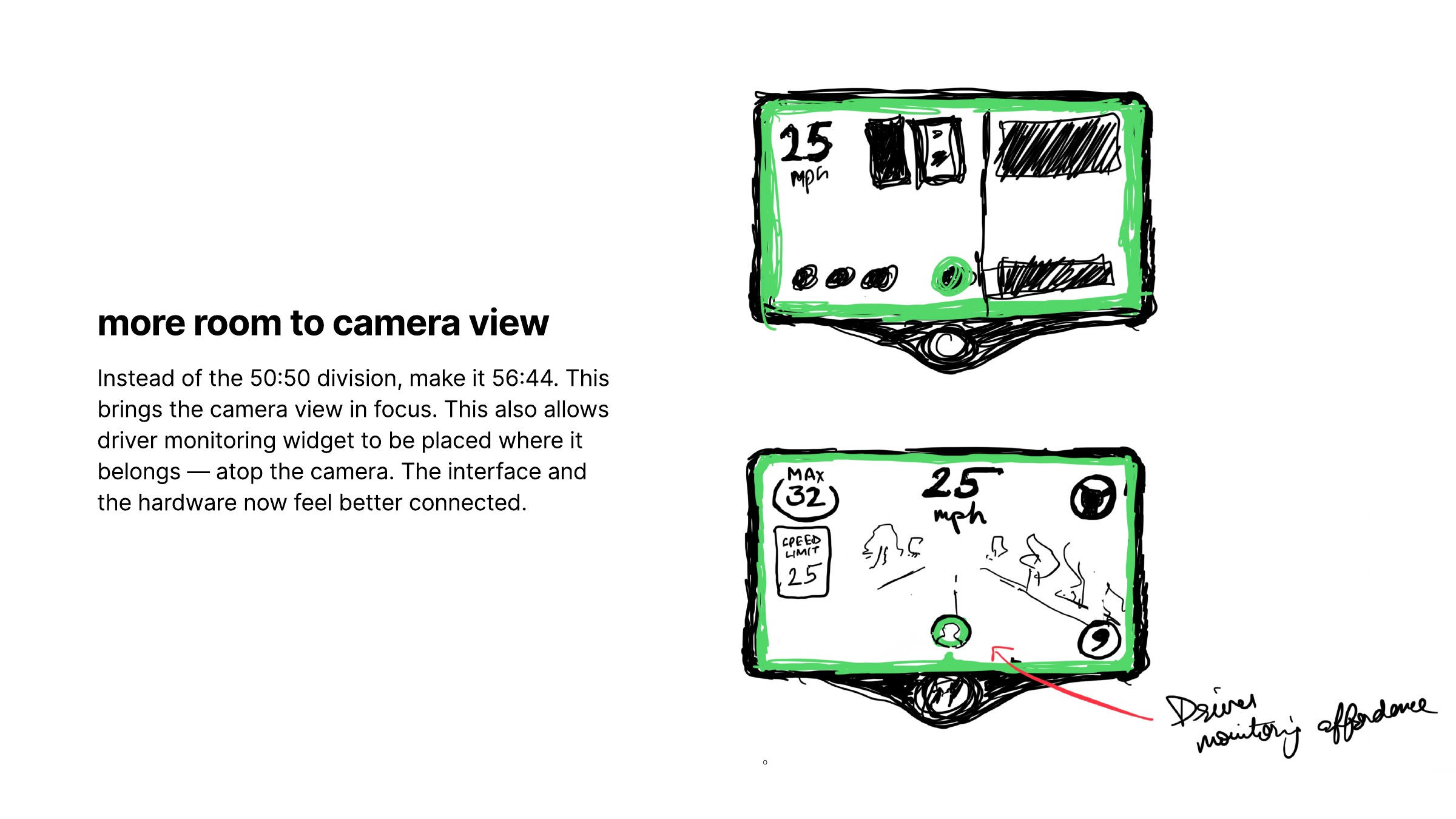
The split-view and camera-only sketches connect placement on screen to the shape of the device.
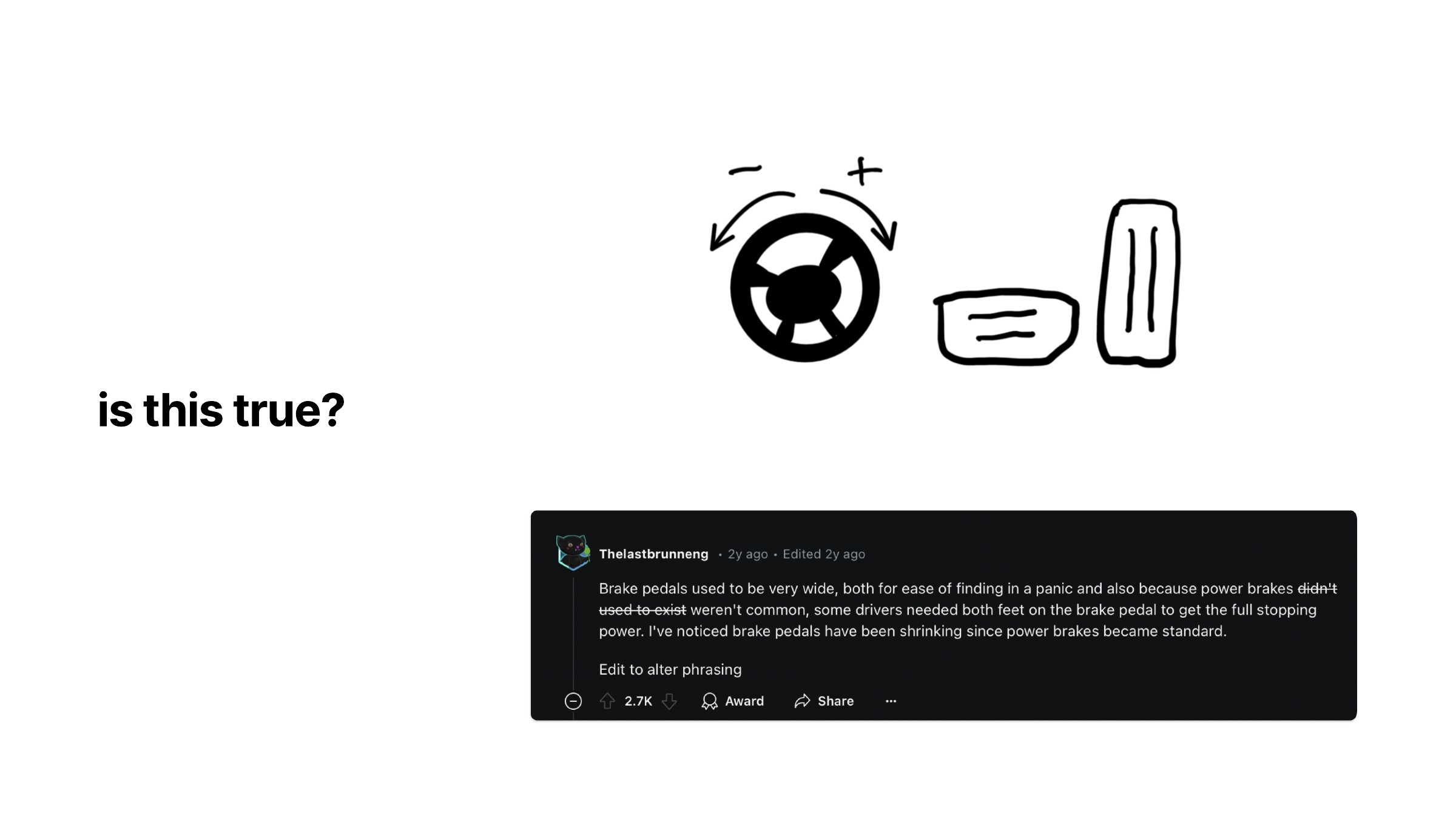
The control symbols developed alongside the layout. A steering wheel and differently shaped pedals offered familiar starting points. My research board included a question about why brake and accelerator pedals have different shapes, alongside an online comment. That comment was a prompt for investigation, not verified evidence for the design.
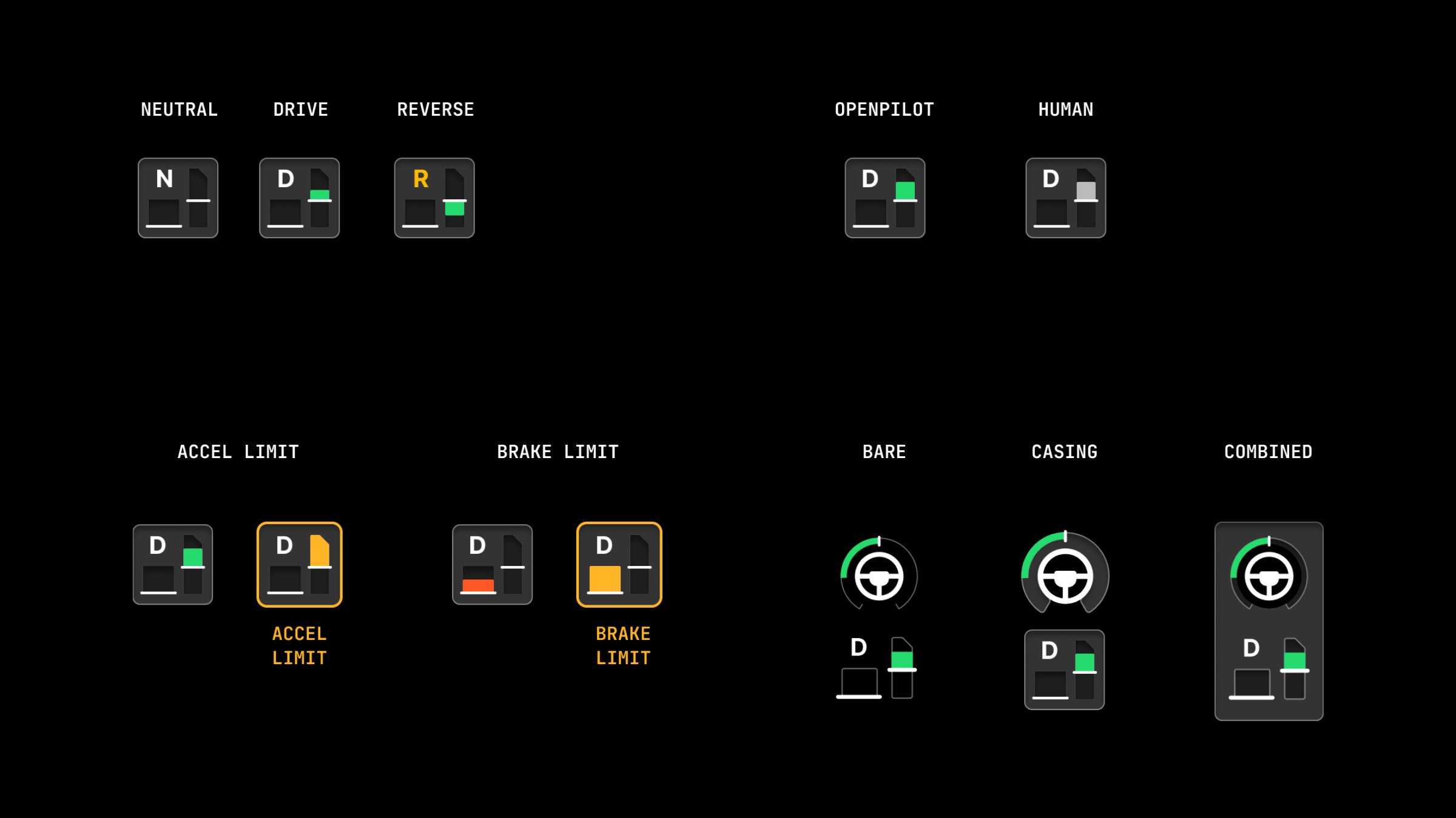
I worked through the symbols in neutral, drive and reverse, with separate treatments for human and openpilot control. Other variants explored acceleration and brake limits, and whether the controls needed a shared enclosure or could stand on their own.
Bringing the interface together
With the visual vocabulary taking shape, I returned to complete screens. I compared speed placement, navigation headers, the relationship between steering and pedal indicators, and the driver-monitoring position. The next board expanded those decisions into confidence changes and takeover alerts.
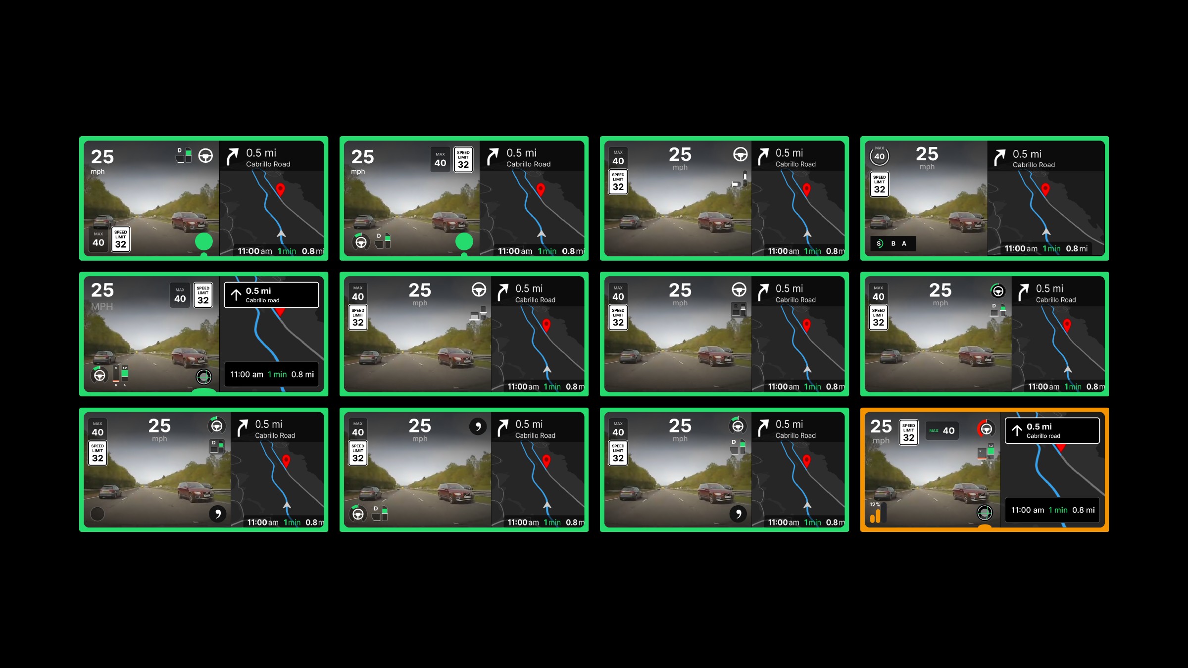
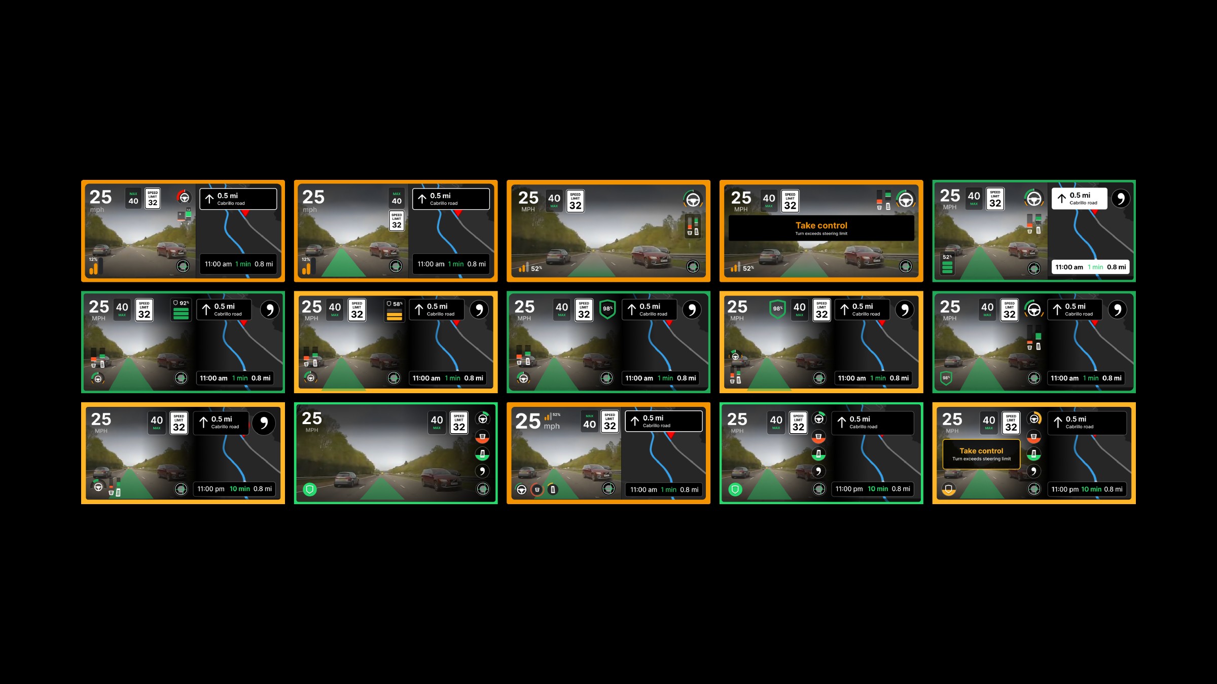
Both full boards remain here so the progression to the final candidates is visible.
The six final candidates brought the main tradeoffs together. Some used a more explicit confidence readout; others reduced it to a compact symbol. Controls appeared as a cluster near the bottom or as a vertical group near the camera/navigation boundary.
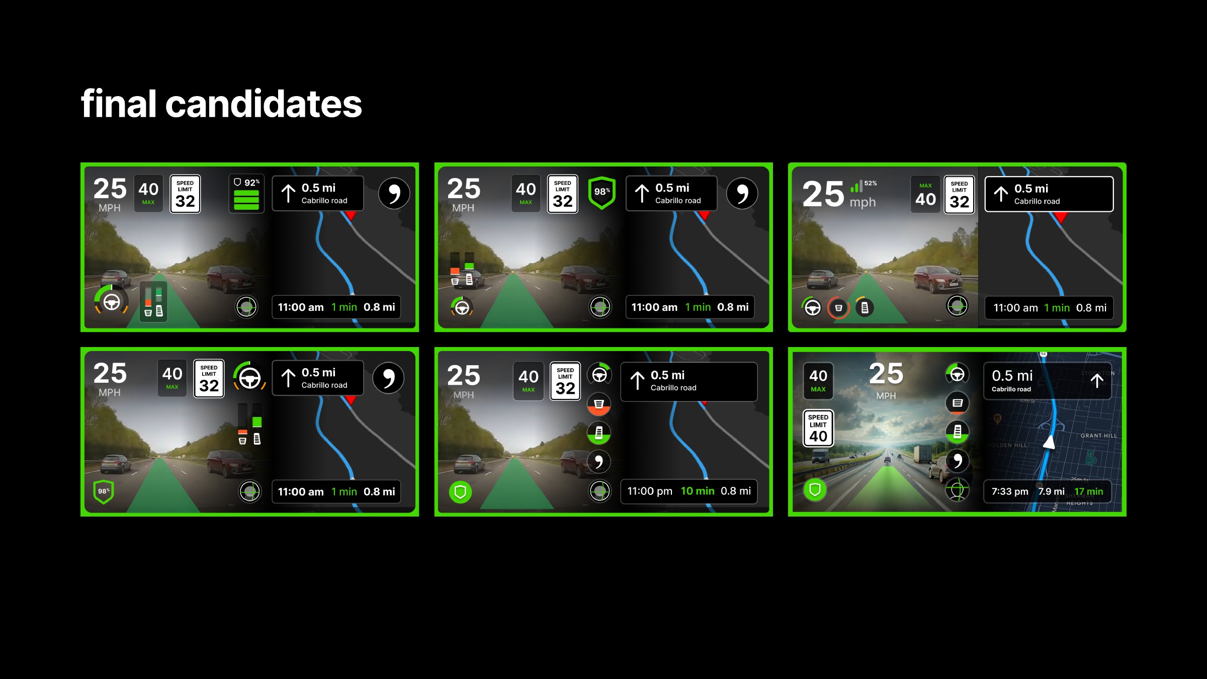
I selected the direction with a vertical column of circular indicators, a prominent camera view and a clear perimeter. It kept recognizable parts of the existing layout while giving the added controls a consistent home. The intention was to make the interface easier to scan without filling the road view with a new panel of instruments.
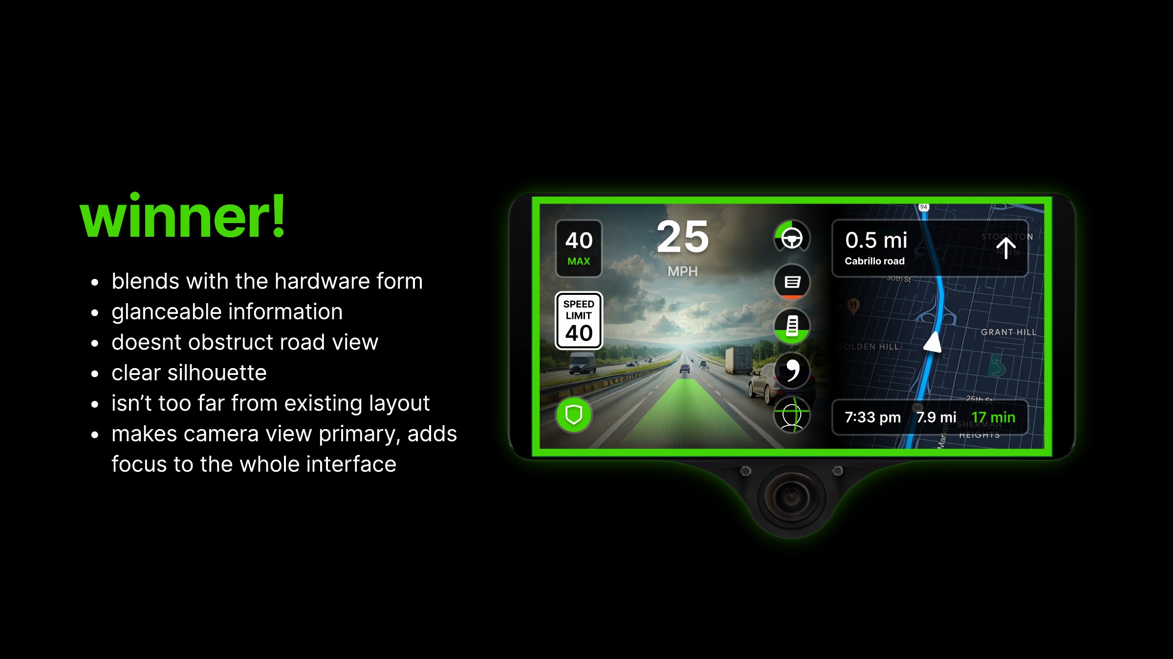
The “winner” in the deck is the selected design direction among these candidates, not a claim of an external award.
The state sheet shows the direction with navigation visible, with the camera expanded, with a takeover alert and with a lower-confidence treatment. The camera-only version retains the same family of indicators at the right edge. In the warning version, the alert becomes more prominent than ordinary status information.
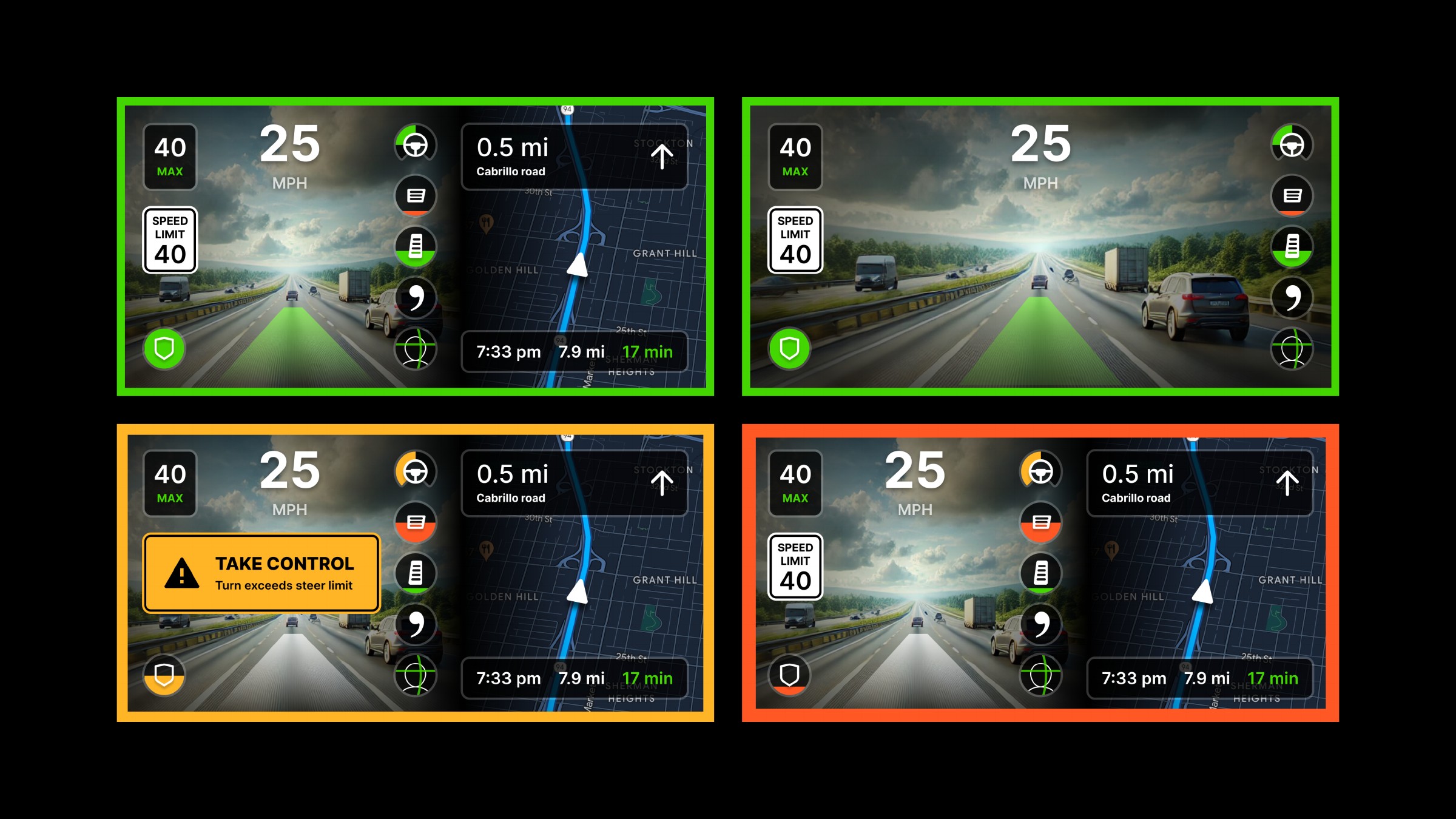
The border provides a broad state cue, while the shield and individual control indicators carry more localized information. The takeover message adds explicit language. These layers were intended to work together; color alone should not have to explain an urgent condition.
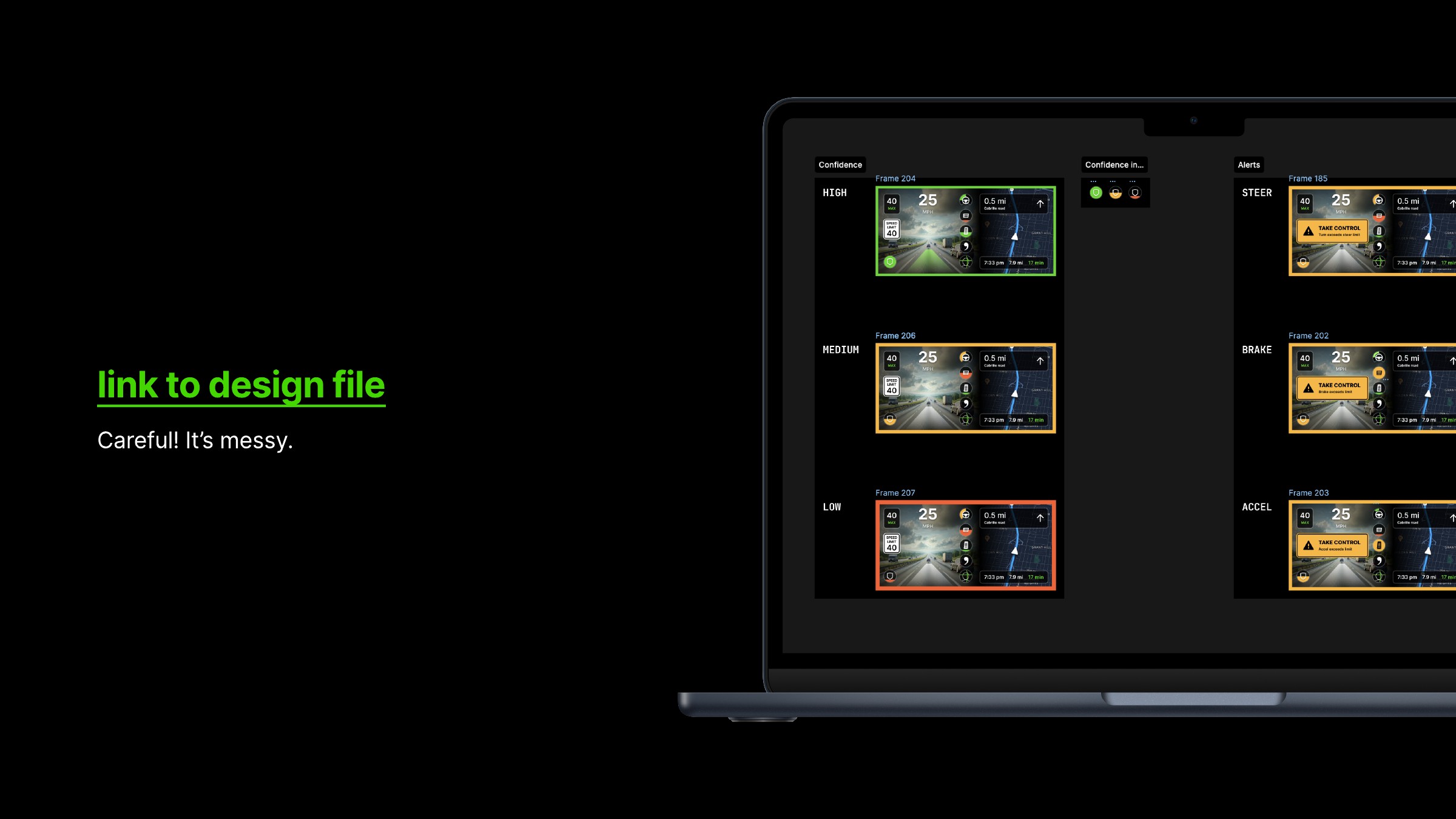
I also organized confidence levels and steering, braking and acceleration alerts in the Figma file. The PDF’s file overview shows that state organization, though the small previews are not a substitute for inspecting the individual frames.
Taking the design out of the canvas
I used a phone displaying the mockups to look at their size and placement in a car, with my dad holding it beneath the rear-view mirror. The photos show the standard split view, a takeover state and the camera-only view in the same general setting.
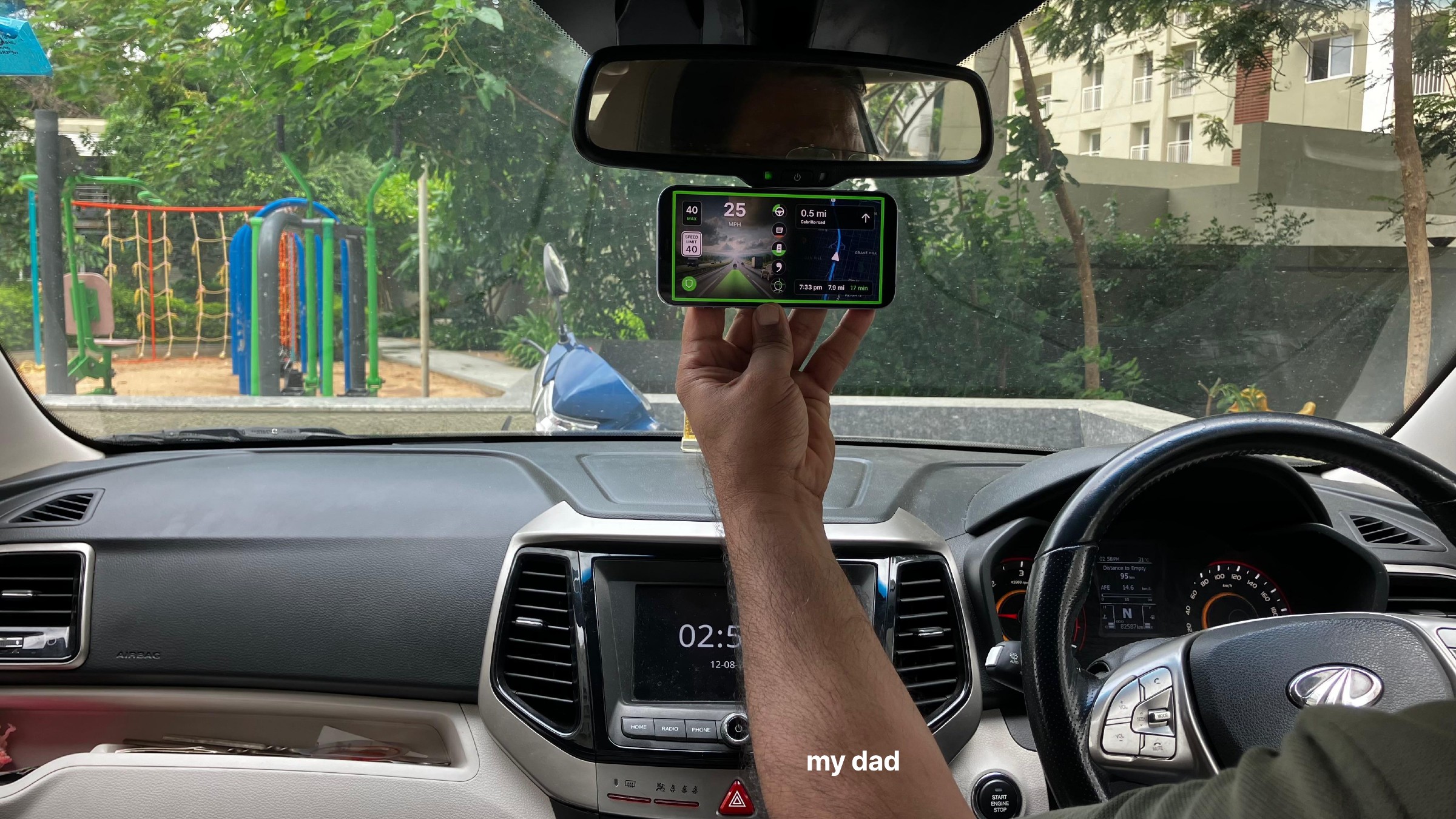
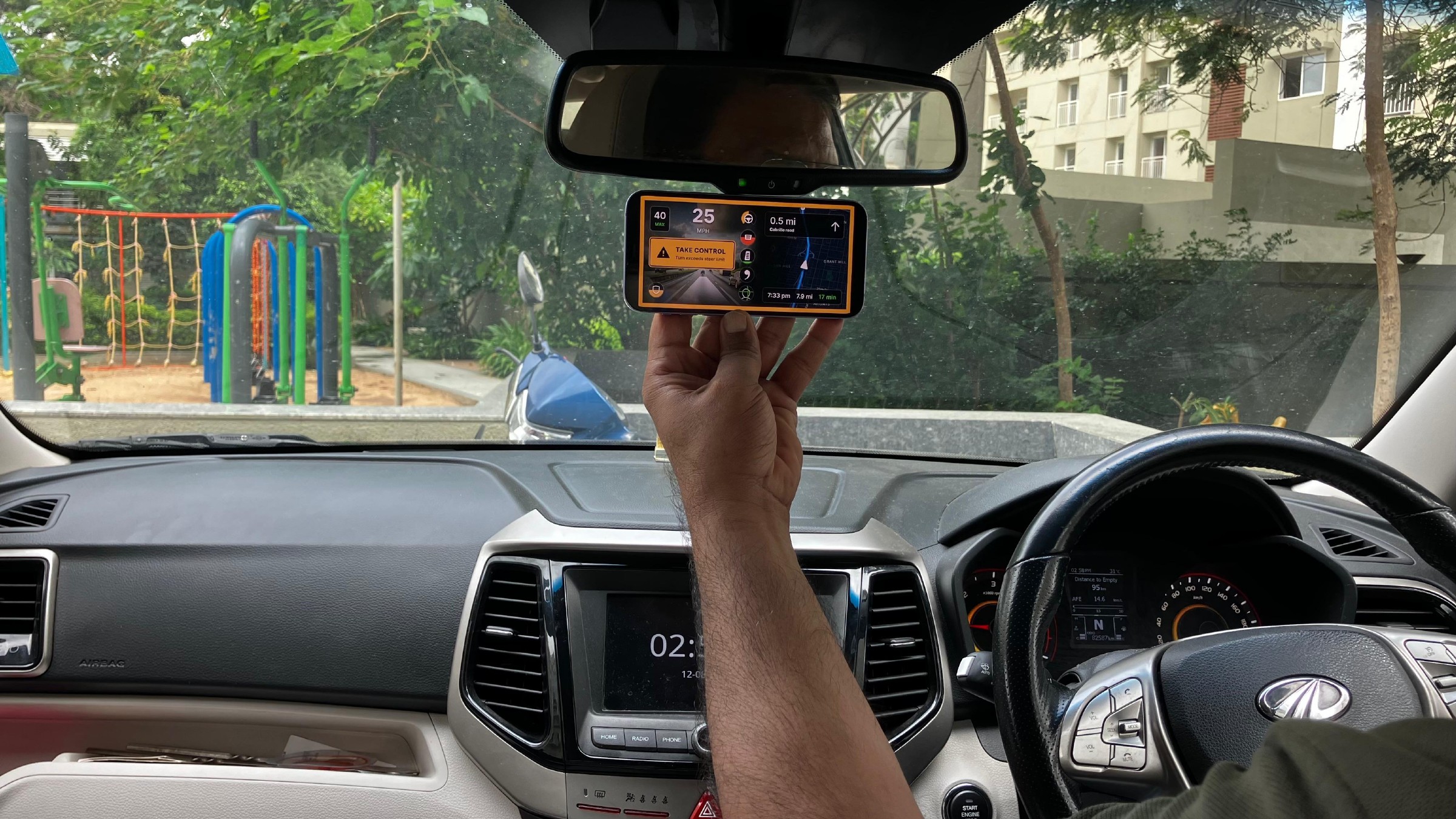
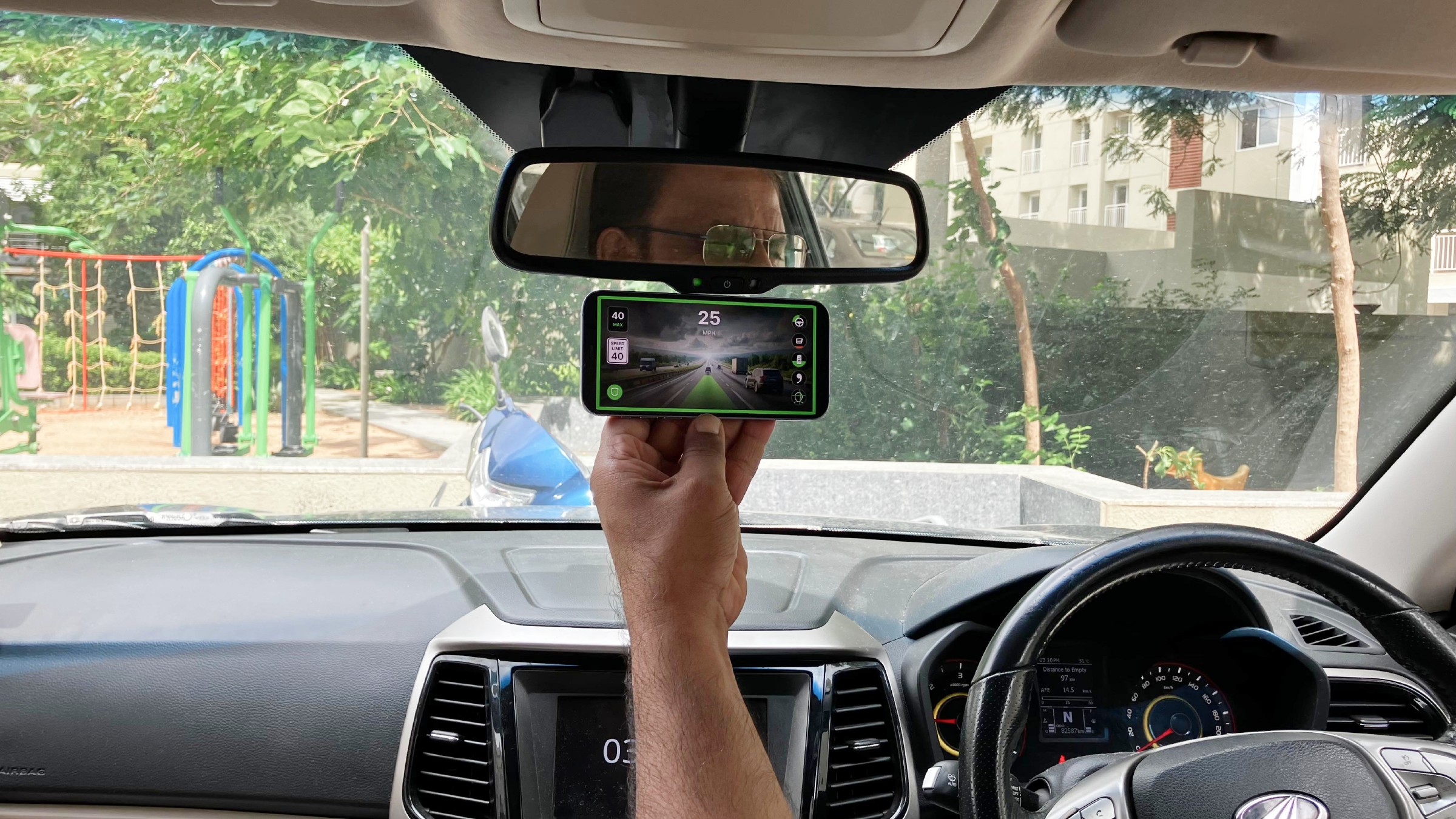
A size and placement check using static mockups. This was not a driving trial or a usability study, and I am not claiming measured improvements from it.
The photos bring back the context of the first windshield sketch. A screen that occupies the whole design canvas becomes a small object among the mirror, dashboard, windshield and road. That is the scale at which its hierarchy ultimately has to work.
Sound as another way to communicate urgency
I sketched an audio vocabulary alongside the visuals. Separate short patterns would communicate engagement and disengagement. For approaching control limits, the proposal moved from a slow pulse around 80–90%, to a rapid pulse above 90%, and then a longer pulse with an alert at the limit.
For confidence, the initial proposal used silence at high confidence, an occasional two-tone cue at medium confidence and a more frequent cue at low confidence. The percentage bands in the deck were exploratory; they were not calibrated probabilities or tested trigger values.
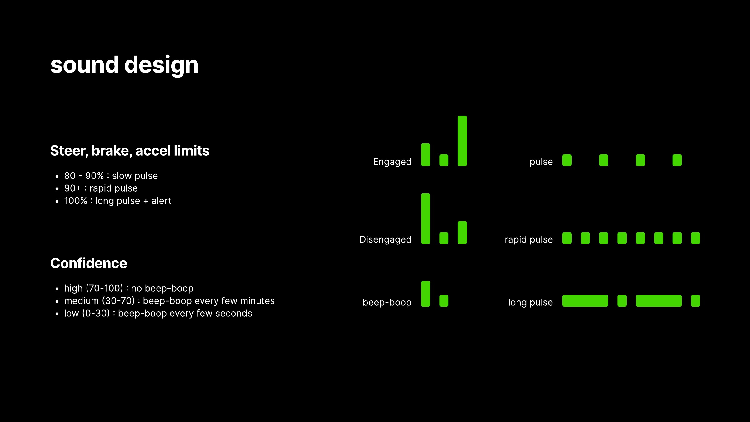
Visual notation for engagement, disengagement, two-tone cues and three pulse patterns. The PDF documents the proposal, not playable audio.
I also wrote a priority order: imminent safety alerts first, then exhausted control limits, low-confidence alerts, medium-confidence alerts, approaching-limit warnings, high-confidence reassurance and ambient status. This was an initial hierarchy, not a finished specification. For example, the high-confidence and ambient categories appear in the priority list even though the confidence proposal otherwise favors silence when things are going well.
Those details would need to be resolved through prototyping. A system of individually understandable sounds can still be distracting when several conditions occur together. The next step would be to test which cues should interrupt, repeat, replace another cue or remain silent.
Where the exploration landed
The final direction brought the new information into a familiar arrangement: speed and limits at the top, camera and navigation as the main regions, and a compact set of indicators tied to the hardware’s form. The larger shift in the process was from displaying more telemetry to deciding what the driver should be able to recognize with less inspection.
The work ends with a hand-drawn rendering of that direction. It carries the same broad silhouette, control column and camera/navigation relationship back into a looser visual form.
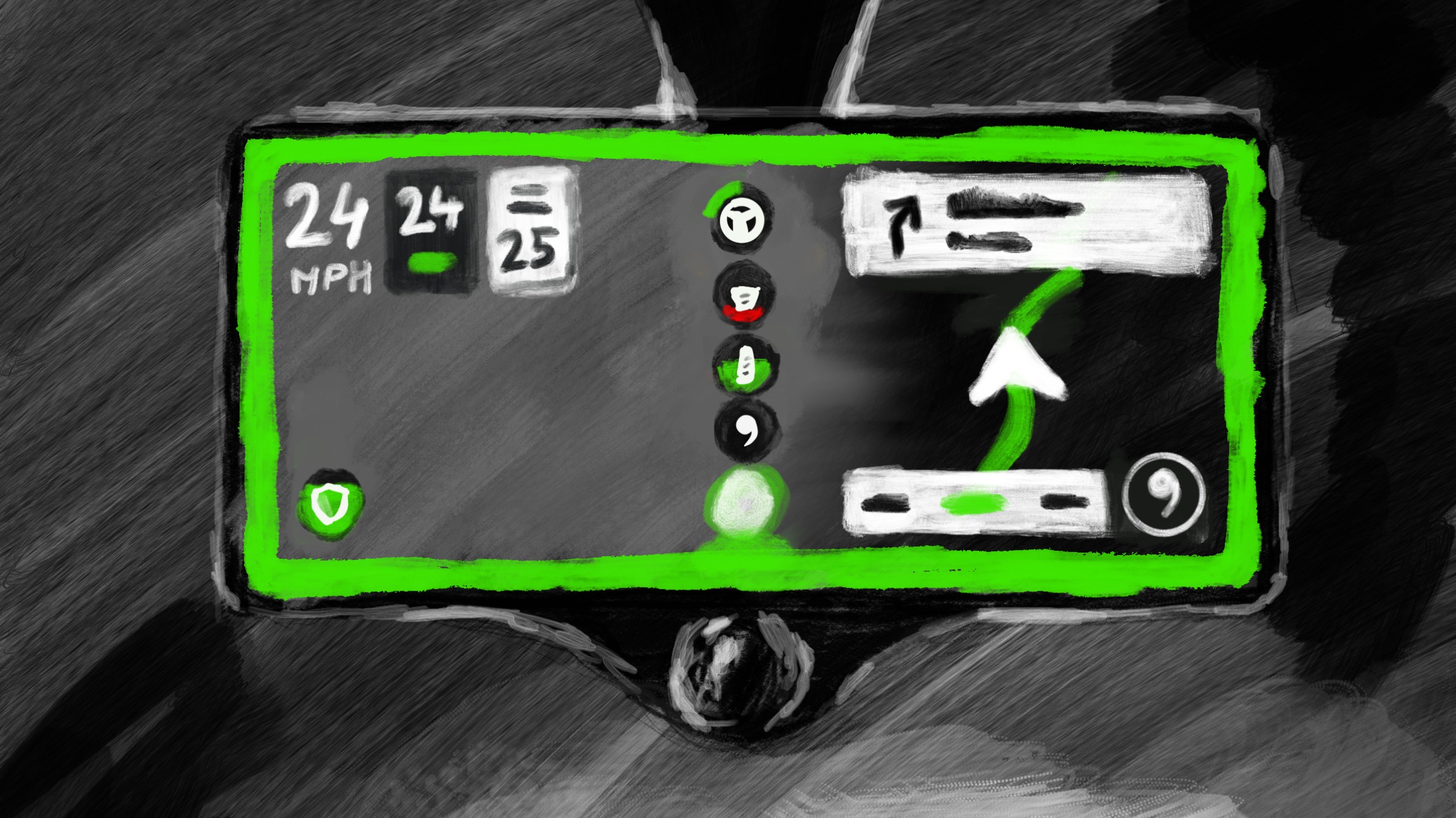
What remains open is whether the proposed signals are understandable quickly enough, whether the warnings arrive at useful moments, and whether the sound vocabulary stays helpful over time. Those are questions for validation with real system behavior and drivers. This exploration establishes the interface direction and the states to investigate, rather than claiming to have settled them.