the last question
Work slots and earnings
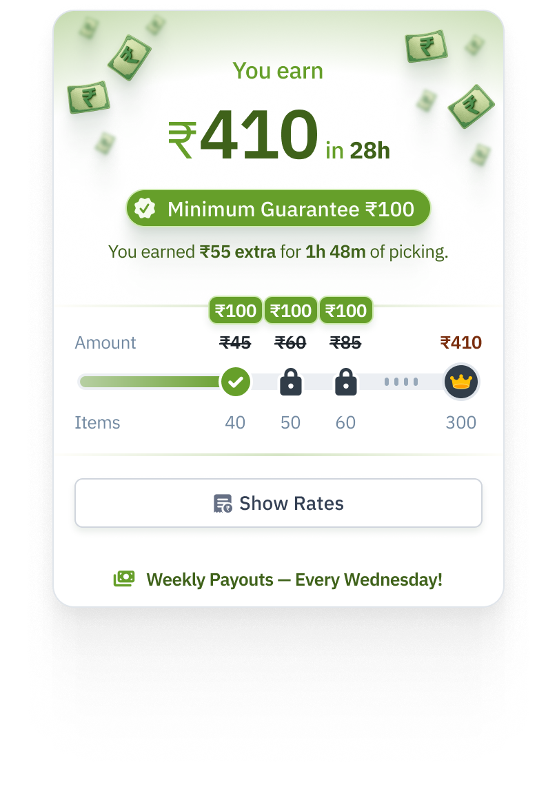
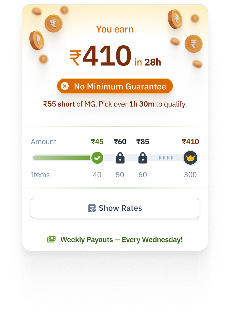
Earnings cards showing a minimum-guarantee top-up on the left and an unmet eligibility condition on the right. Open either image to inspect it at full size.
The problem
Packers at Zepto worked full time. With Flex, we wanted people to book slots and work at their own convenience. I designed Flex end to end.
Before someone could choose a work slot, they needed to understand Flex, choose where to work, complete their application and know what was still pending. Once onboarded, they needed to distinguish an available slot from a waitlisted or confirmed booking.
Earnings and incentives became a sub-project within Flex. A packer needed to understand both the offer before booking and the money earned afterward. The interface had to explain item-based earnings, minimum-guarantee eligibility, weekly incentives and payout timing.
Who the interfaces were for
The onboarding screens were for people applying to work as packers at Zepto’s stores. Their tasks were choosing a work arrangement and location, supplying documents and arranging an interview.
The booking screens served onboarded Flex packers. Their recurring task was to find work that fit their availability, compare the store and earning offer, and check whether they had a confirmed place.
The earnings screens served those same packers before and after a shift: checking the rate for a slot, reviewing their earnings, and understanding a top-up or an unmet condition.
Store staff were involved in the application handoff. The interview confirmation exposed the assigned store, a store-manager contact action and an OTP to share with the interviewer. Those details connected the applicant’s self-service flow to a person at the store.
Designing the planned video-led flow
The non-video onboarding documented in Flex OB was the version we shipped. I also designed a video-led experience. Video production and technical complexity delayed its implementation. The following sequence shows that planned flow.
I designed an onboarding experience with a presenter above an interactive panel. The panel carried the current task and its controls: choosing a work mode, entering work details, uploading documents or booking an interview. More involved tasks opened a sheet or a full-screen view, such as the area map and camera.
After mobile verification, the planned flow had four main steps: choose a work mode, enter work details, upload documents and book an interview. The presenter remained above the task panel, while the step indicator and primary action gave the applicant a consistent place to continue.
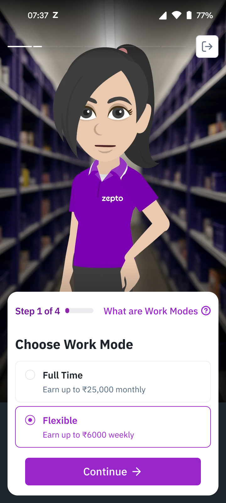
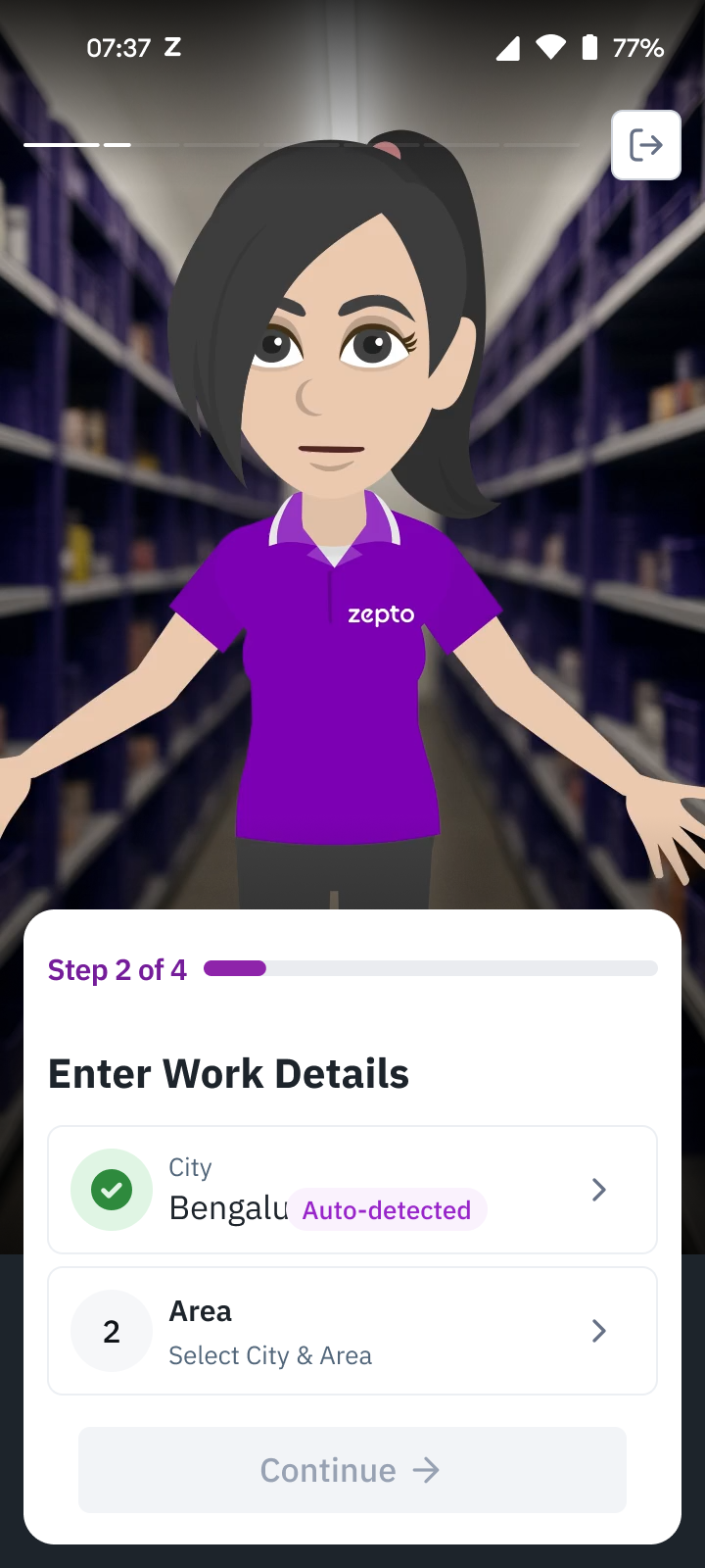
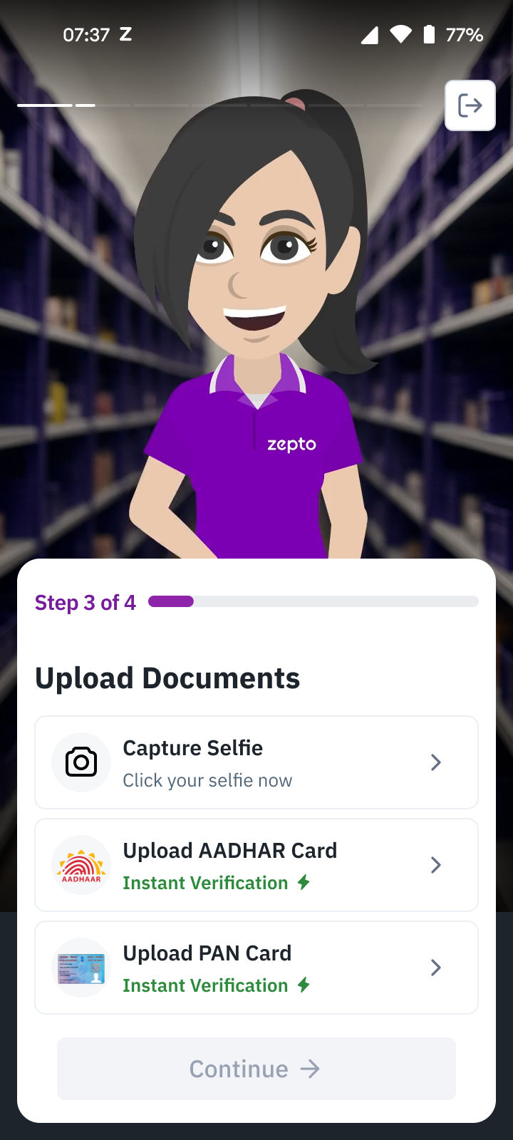
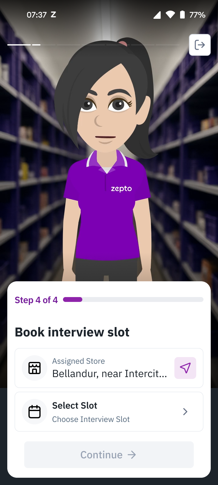
The four main steps of the planned video-led experience after mobile verification. Each step’s detailed tasks and recovery states follow below.
Starting with mobile verification
The entry flow asked for a mobile number and then an OTP. I laid out the empty, verifying, verified and incorrect-code states, including a resend countdown. The incorrect-code message stayed beside the input so the applicant could correct that step. Each state showed the applicant how verification was progressing.
Choosing a work arrangement
I explored a compact choice between full-time and flexible work, and a more detailed comparison. The compact version put earning expectations beside each option. The expanded version also showed working hours, distance to the store and the differences between the two work modes.
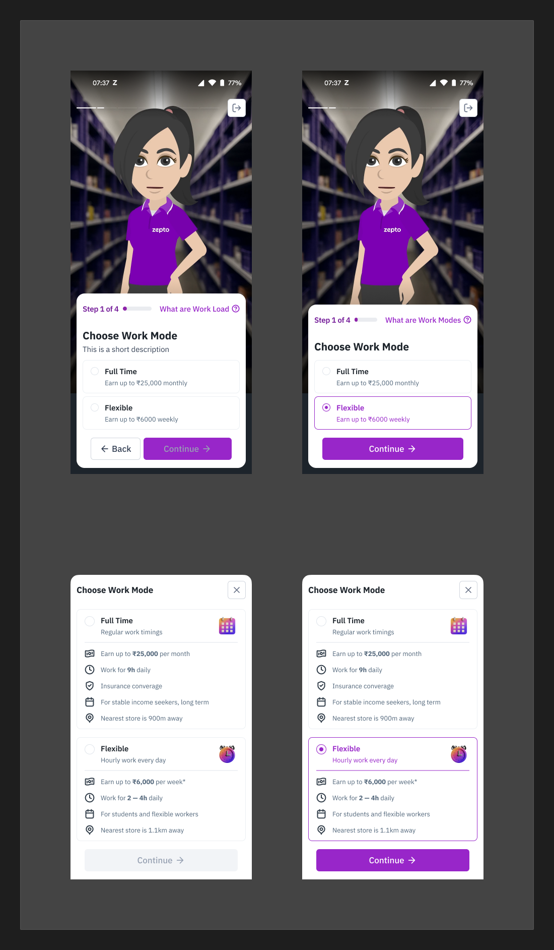
Two treatments of the same choice. The lower pair gives more room to the comparison. Selected and unselected states are shown within each treatment.
The compact choice sat within a four-step onboarding flow. Selecting Flexible changed the option’s border and text and enabled Continue. In the detailed treatment, the same selection applied to a larger card containing the work terms. The compact version reserved more space for the presenter, while the comparison gave the applicant more information before choosing.
Choosing where to work
Work details separated the city from the areas within it. The city could be detected from the current location or chosen manually from a searchable list. The manual choice let applicants select a different city for work.
The area selector allowed up to three areas. An area could expand to reveal stores and their distances. A separate map put the stores in geographic context, with a selected store’s address, distance, earning offer and directions action. The list supported choosing areas, while the map helped inspect a particular location.
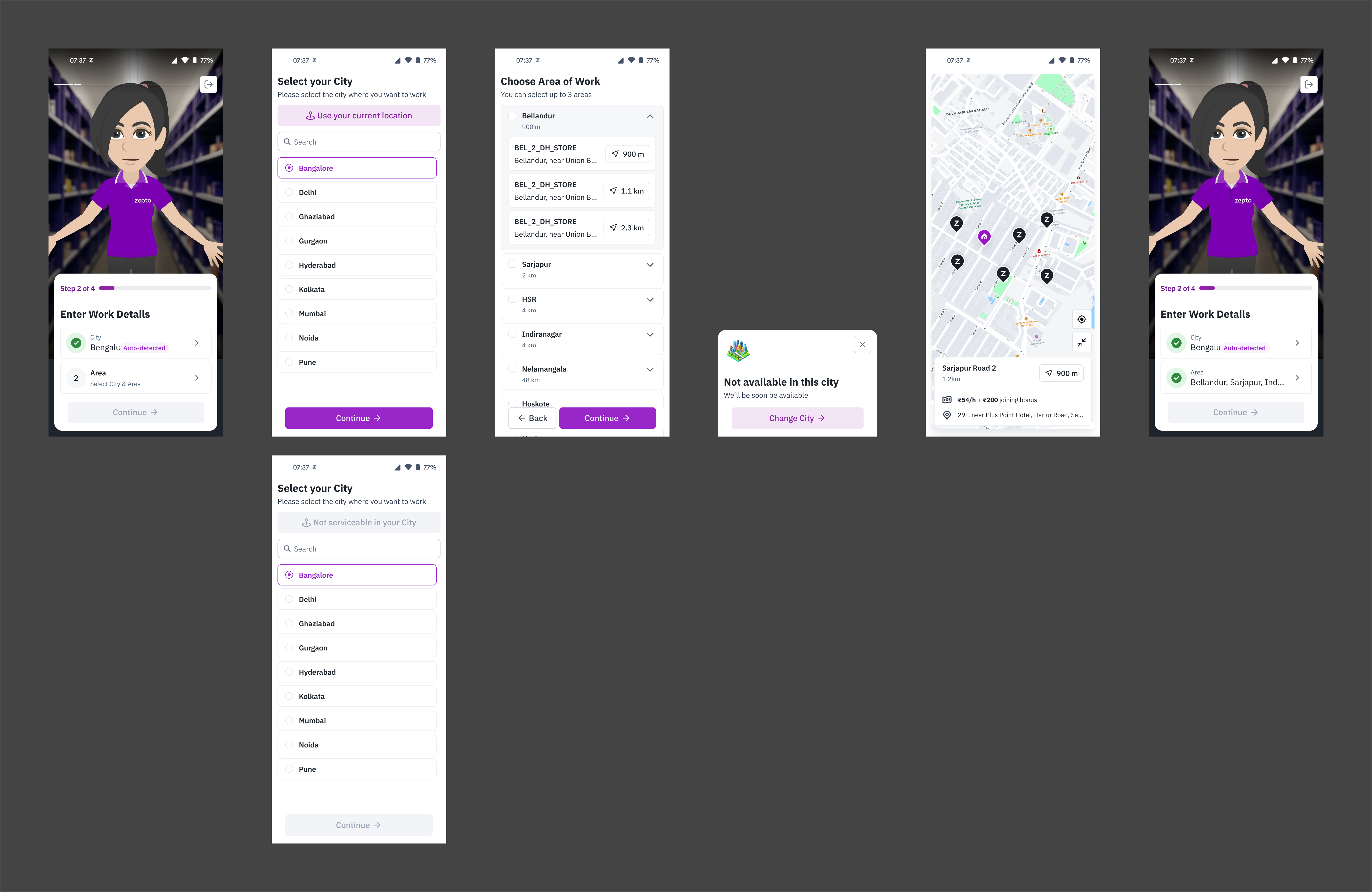
The work-details flow, including the unavailable-city branch. The map and list answer different parts of the location decision. Amounts and locations are design examples.
When Flex was unavailable in a city, the message offered “Change City.” Back in the work-details summary, the city and area remained separate editable rows, with checkmarks for completed entries. This kept the location decision revisable instead of burying it inside the rest of the application.
Completing documents and recovering from errors
I broke document collection into a checklist: selfie, Aadhaar and PAN. Each item opened its own capture or upload task. The applicant could see what the application required without handling every document on a single screen.
The selfie flow introduced capture instructions before opening the camera. The camera then repeated the positioning guidance around a circular face frame, with reminders about accessories and a visible Help action. Separate capturing and captured states showed what the system was doing after the shutter action.
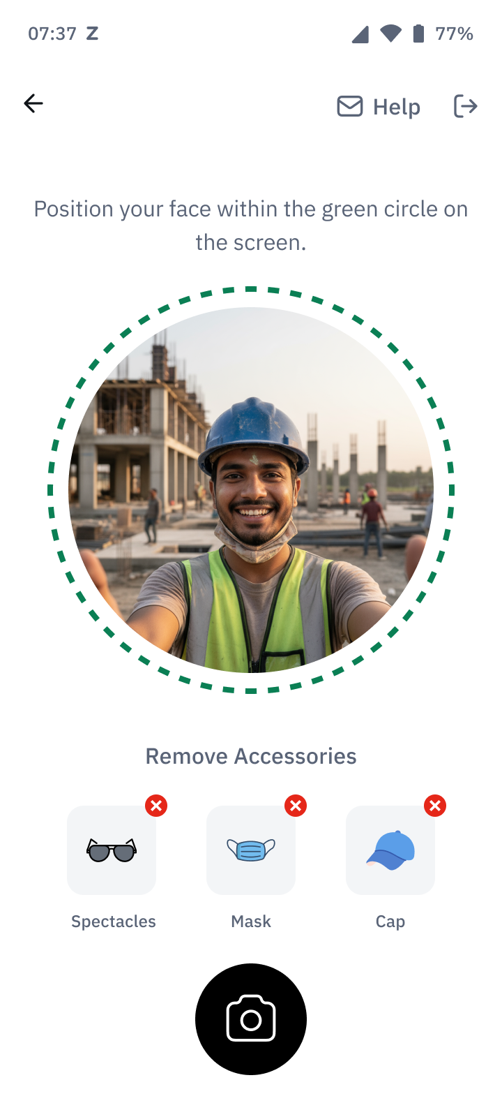
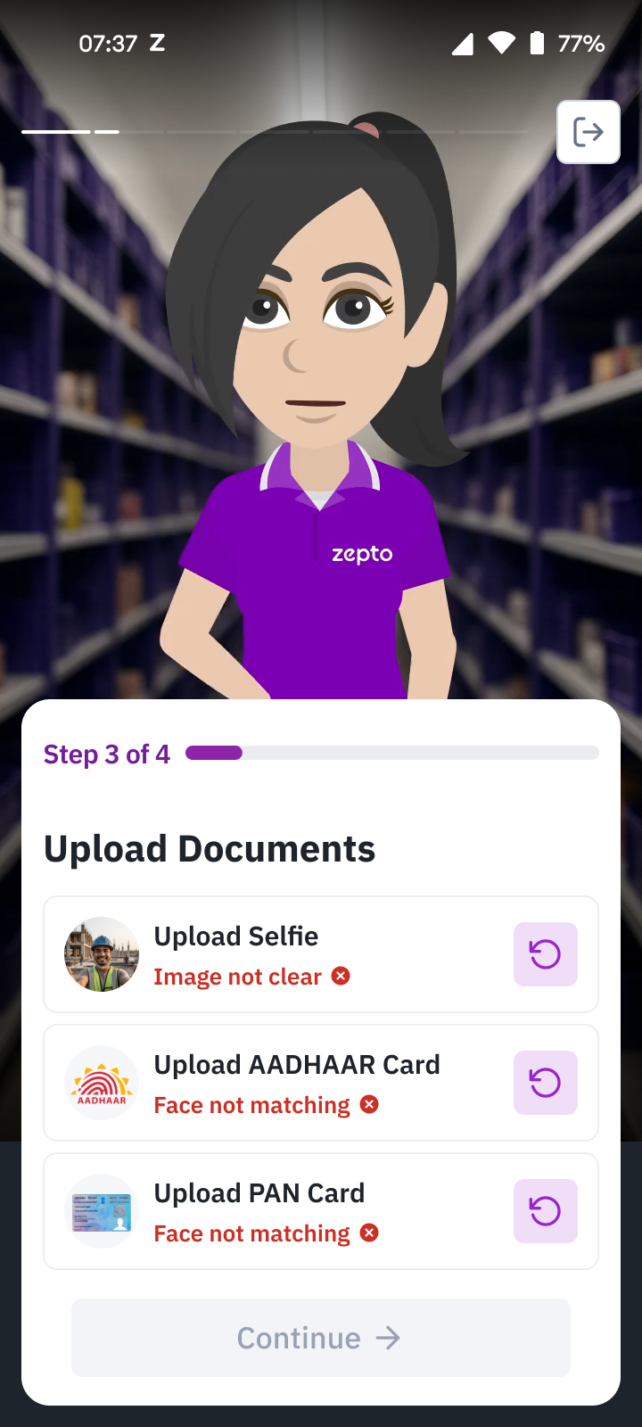
The checklist, selfie guidance and an error-recovery branch with item-level retry controls.
For document photos, the designs separated capture from confirmation. Aadhaar had front and back steps. Before confirming a photo, the applicant was asked whether the whole document was visible and easy to read, with Retake and Confirm actions. An uploading state followed confirmation. This placed a correction opportunity before submitting an unreadable image.
Verification failures returned to the checklist with a reason beside the affected item and a retry control. “Image not clear” called for another capture. Other branches covered duplicate Aadhaar, an application already in progress and an unmet age criterion. Each condition had its own next step, including support where needed.
Scheduling the interview and handing off to the store
The interview step showed the assigned store before asking for a time. Available interview times were grouped by day in a sheet, with a visible selected state and Continue action. After selection, the summary brought the time back into the onboarding panel. This let the applicant review the appointment without reopening the chooser.
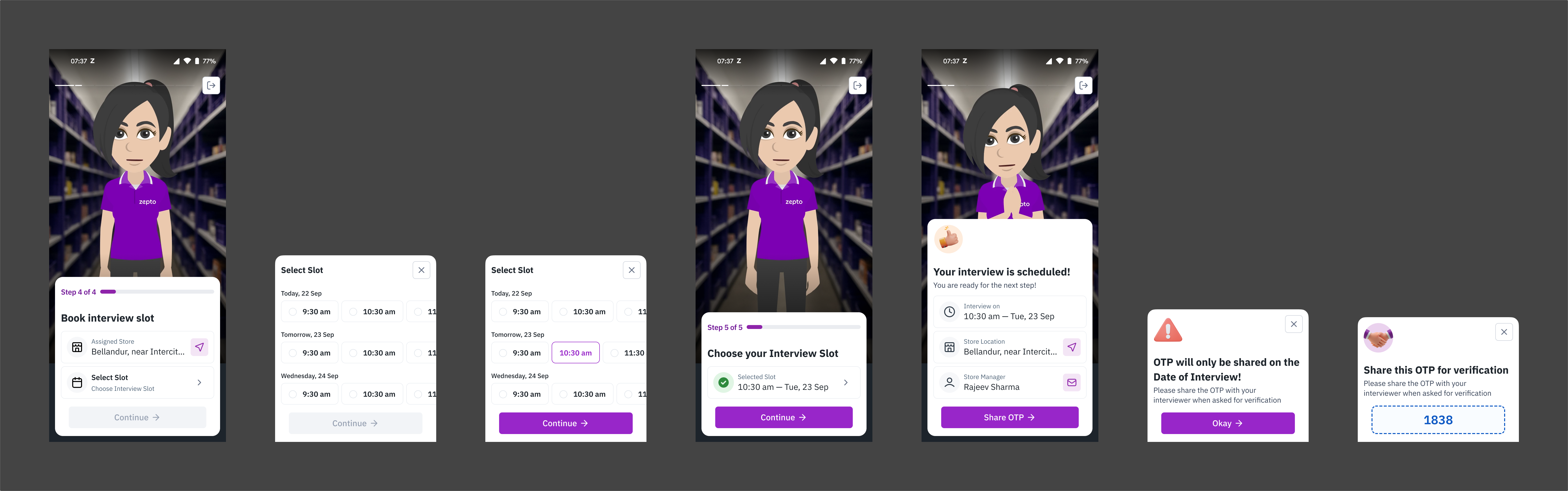
Interview booking, selection and confirmation, followed by the OTP handoff states. These are interview appointments, distinct from the work slots booked after onboarding.
The confirmation collected the appointment time, store location, directions and store-manager contact in one place. The OTP flow explained that the code would only be available on the interview date and was to be shared with the interviewer for verification. The applicant therefore had both the appointment details and the instructions for the in-person handoff.
Making the remaining application state explicit
After the interview, a waiting screen said that the result would be communicated when ready. The shortlisted state introduced contract review as the next task. The terms sheet had an explicit “Agree and continue” action, followed by a message explaining that the applicant would need to log in again to access training.
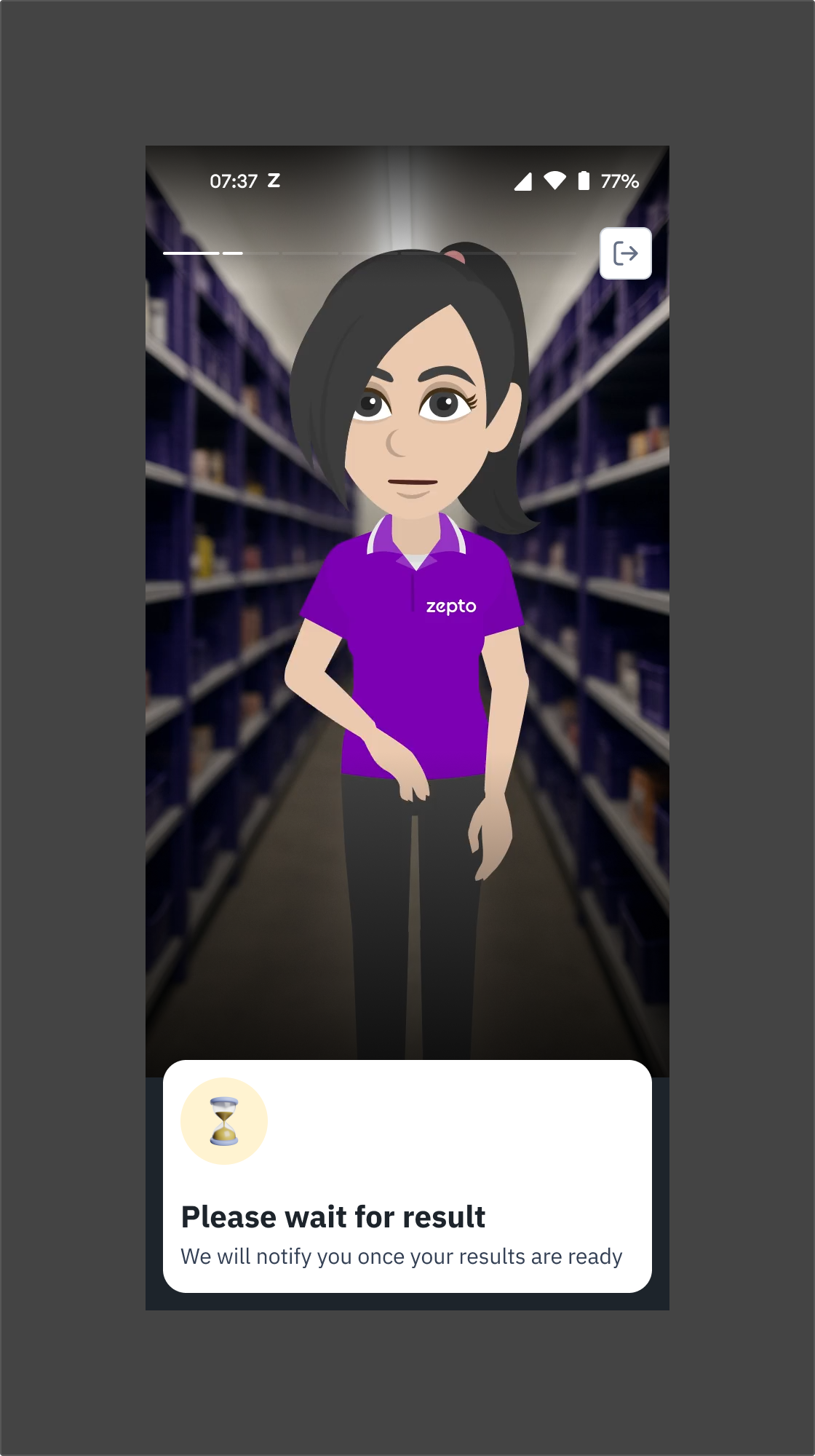
Waiting for a decision is different from an incomplete input. This screen tells the applicant that the next update comes from Zepto.
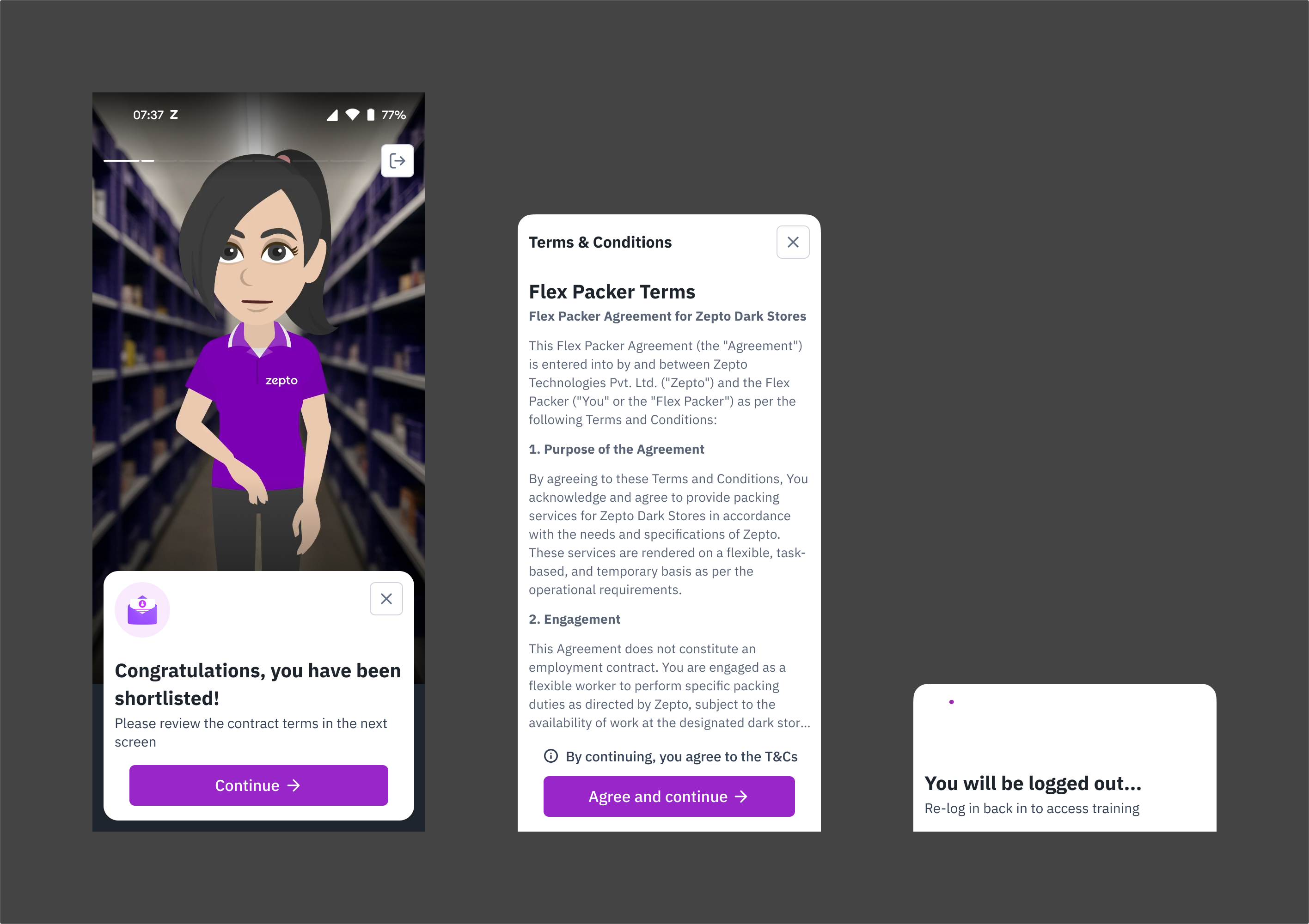
The planned transition from a shortlisted application to reviewing terms and accessing training.
Working through slot availability and booking status
The booking screens organized work by week, day and store. A slot card showed its hours, duration and earning offer. Filters separated upcoming, available and booked slots.
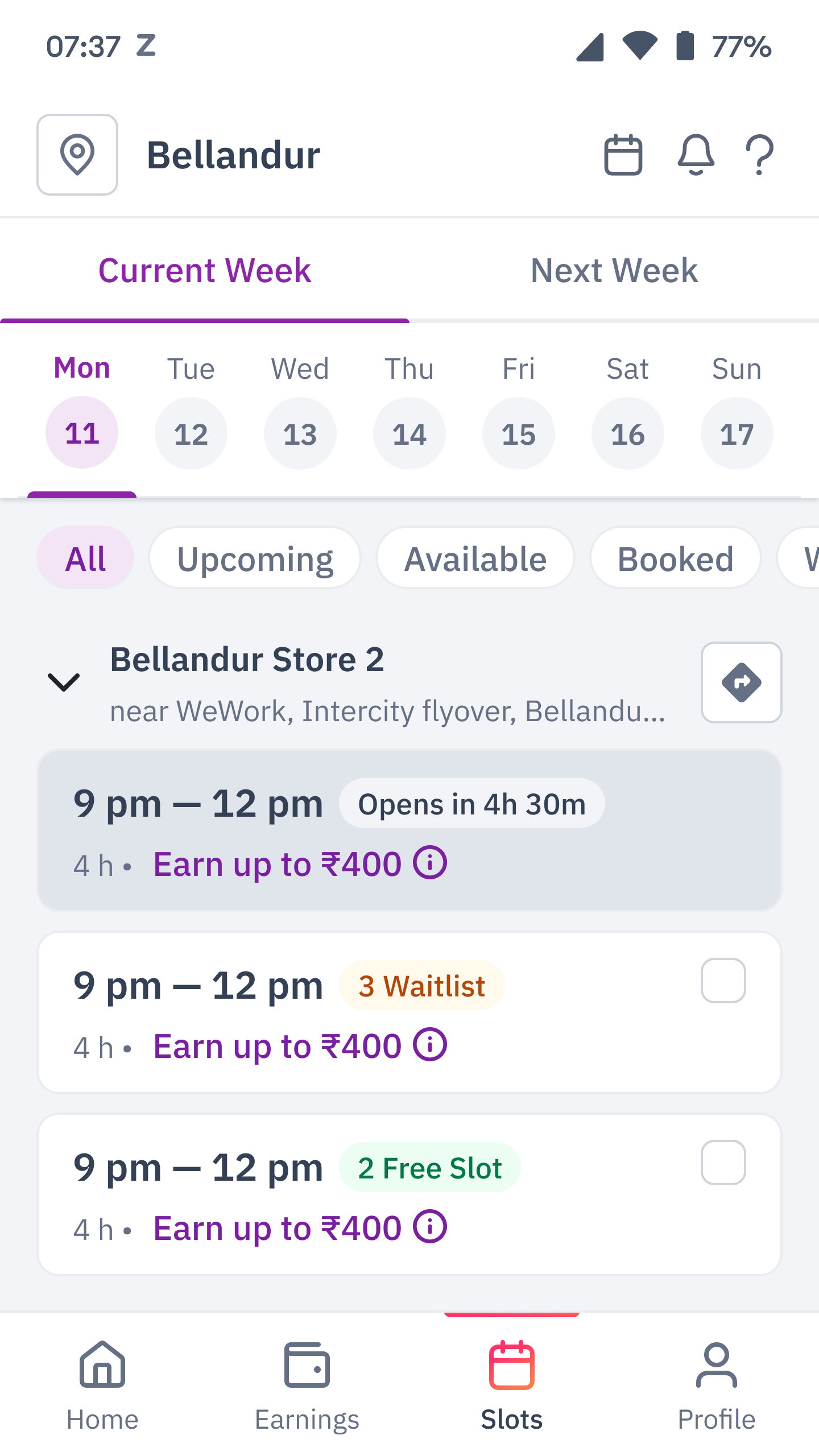
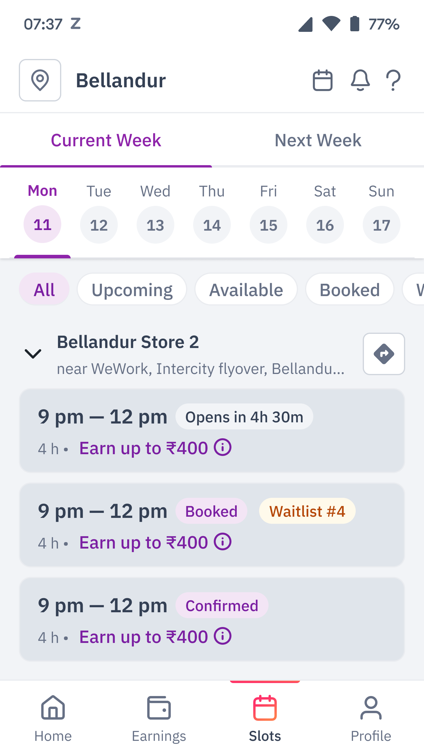
Slot selection and booked-slot states from the same flow.
Bookings could be waitlisted or confirmed. The design kept “Booked” and “Waitlist #4” visible together, while confirmed bookings showed “Confirmed.” An upcoming slot showed when booking would open. The same slot-card structure covered future availability, waitlist position and confirmed work.
Earnings and incentives: explaining the amount
A worker could complete work without qualifying for a minimum-guarantee top-up. Another could earn more than that guarantee through the item-based rate. The interface needed to explain how eligibility and item-based earnings contributed to the amount earned.
I explored the explanation across the home summary, daily and weekly history, slot details and rate cards. The Earnings and Incentives workbench records the evolution from top to bottom. The examples below follow selected stages from that workbench before the final v2.4 direction.
From a locked amount to a stated reason
An earlier draft put “You earned ₹0” above separate attendance and item-count progress bars, with a warning that the minimum guarantee was locked. A subsequent exploration replaced that zero with “Rewards are Locked” and a sentence about low attendance. It also separated the warning from the progress display. Other branches named different unmet incentive conditions, including no-shows, defect rate and items picked.
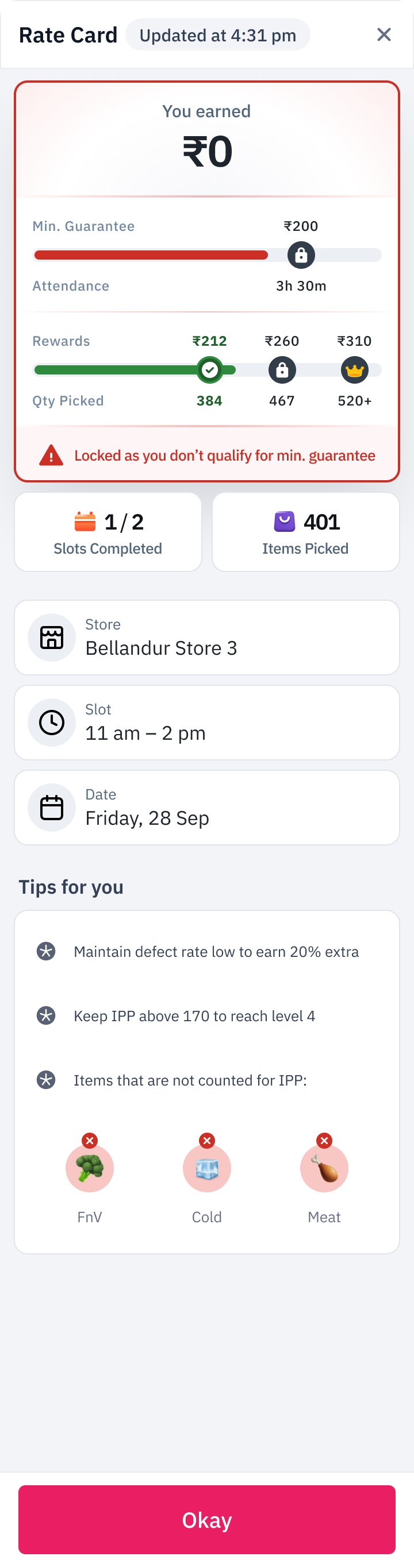
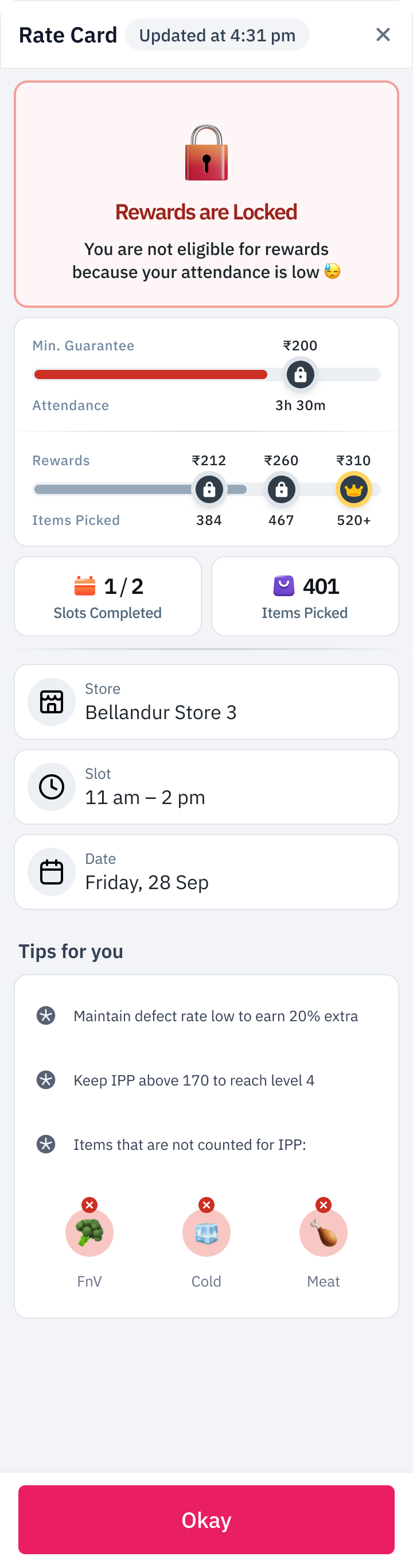
Rejected workbench approaches. The first comes from the board marked “DO NOT USE, OLD DRAFT”. The second appears in the following draft. Both retain the worker’s activity counts and slot context.
These explorations changed what the worker encountered first: an amount, a lock, or an explanation. In the final earnings treatment, the amount earned remained the headline. Minimum-guarantee eligibility appeared as a separately labelled condition beneath it.
Following earnings from the week to the slot
The final v2.4 flow began with a home summary, including empty and calculating states. In the earnings view, Daily and Weekly controls changed the period being inspected. The weekly view led into individual days; the daily view broke the amount into slots. A slot’s detail sheet kept its store, time and date beside the explanation of earnings.
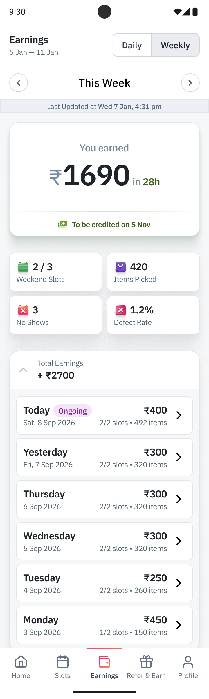
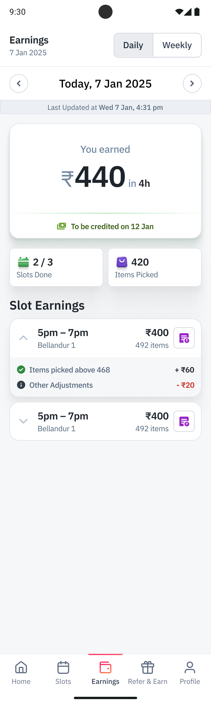
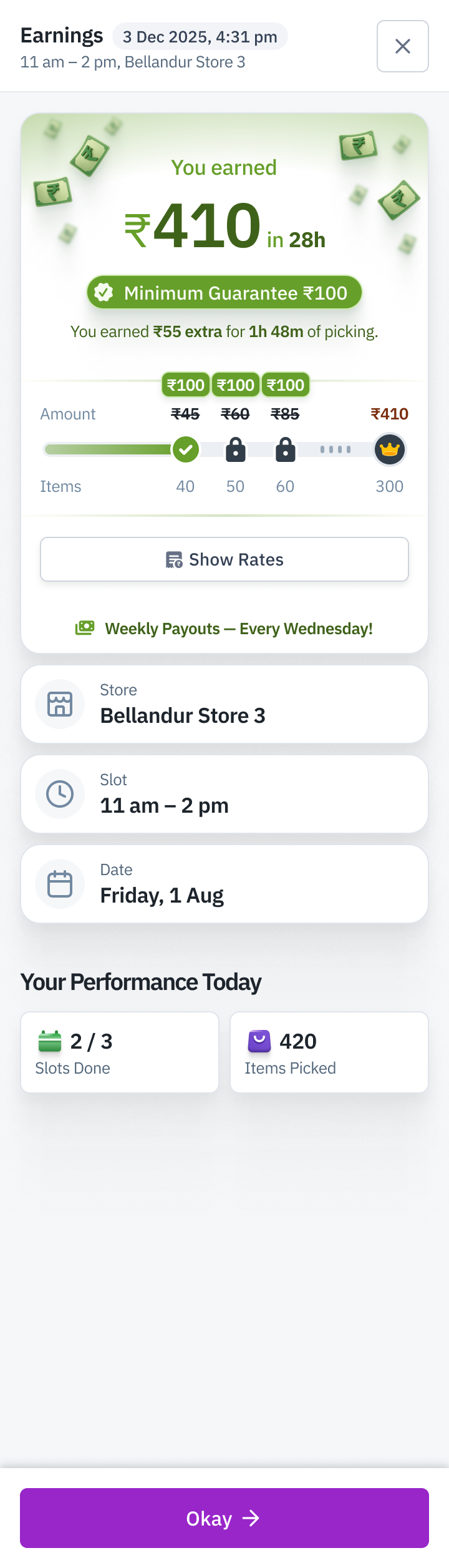
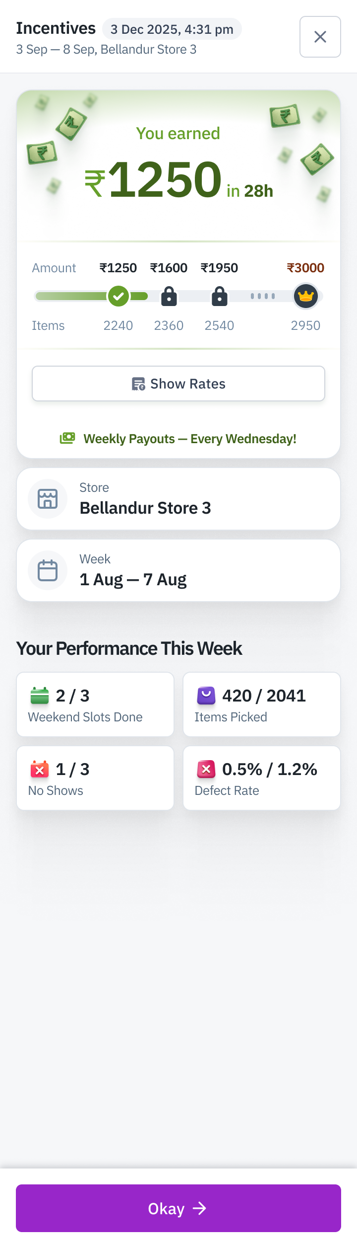
Connected views from Final Draft v2.4, covering slot earnings and the weekly-incentive branch. The complete handoff overview also shows the home states, paid state, adjustments, rate-card entry points and loading branch.
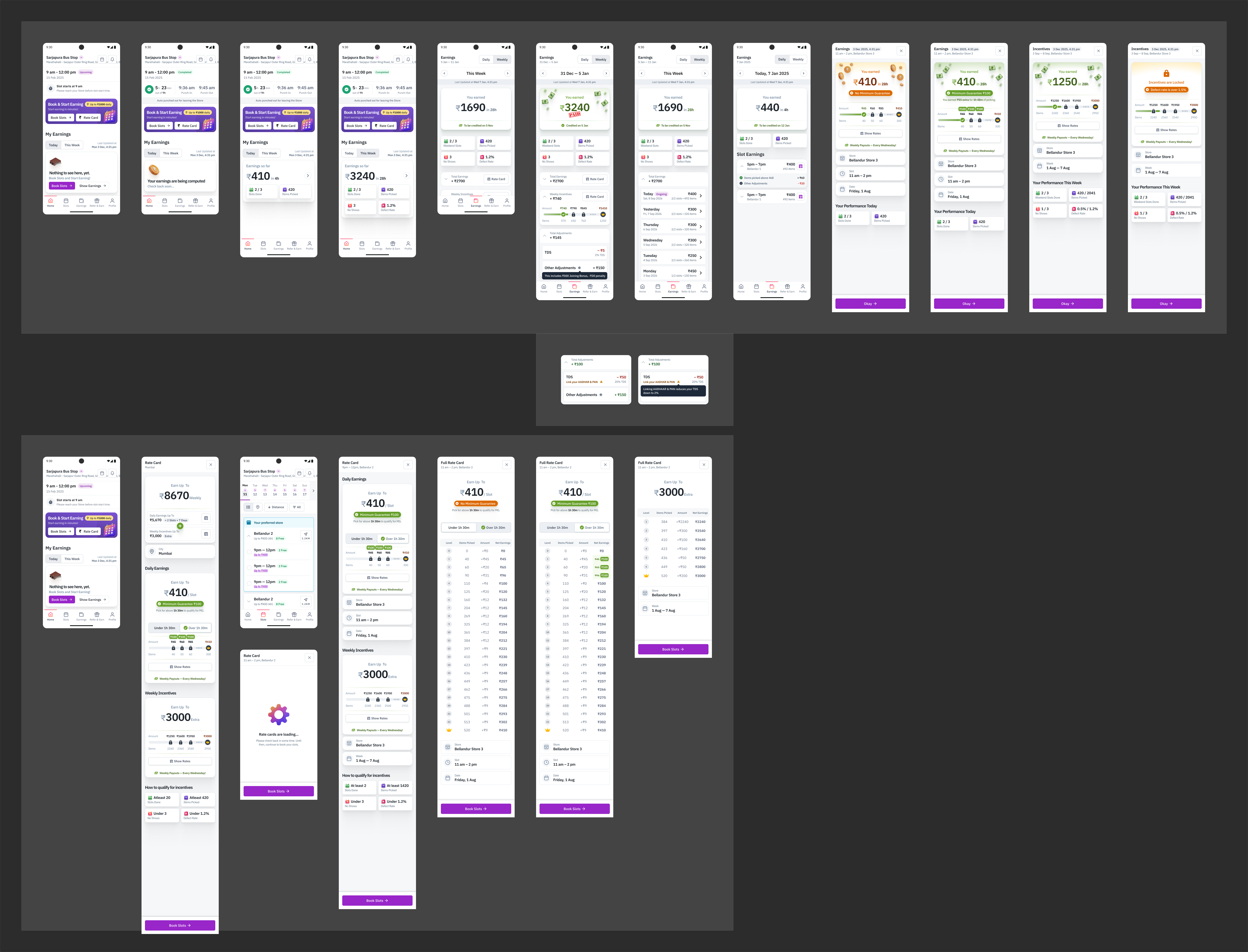
Expandable rows exposed daily earnings, incentives and adjustments, while performance tiles kept the relevant activity counts nearby. Payment had its own status and credit date, so workers could check when their earnings would reach them.
Making minimum guarantee specific
I laid out four cases: whether the worker crossed the time threshold, and whether the item-based earning slab was below or above the minimum guarantee. This was more precise than a single success and failure pair.
In the below-guarantee case, the green treatment showed the extra amount and the picking time that qualified for it. The orange treatment retained an earned amount and named the missed top-up and the time required. Text and icons reinforced the colour treatments.
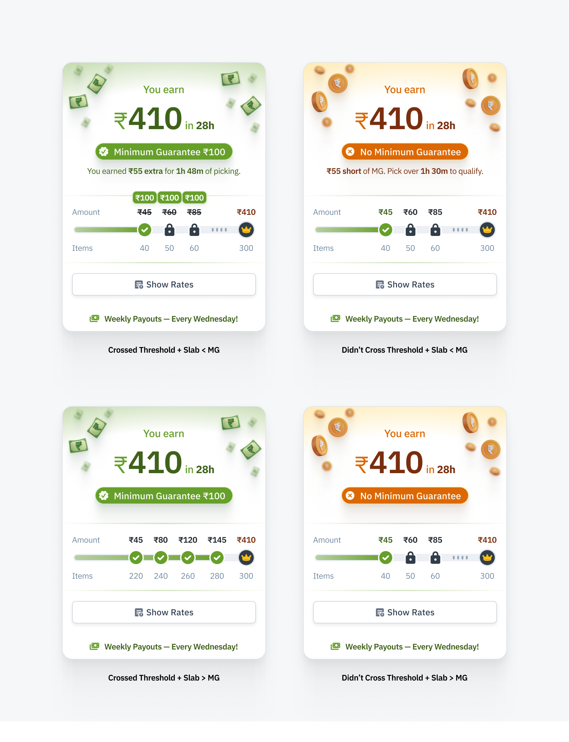
The four-case comparison on the final-draft page. The top pair explains a top-up or a missed top-up. The lower pair covers item-based earnings above the guarantee.
The same distinction appeared inside the daily slot list. An expanded row could say that a top-up had been earned, explain the amount missed and the eligibility threshold, or show the item-based earning with the guarantee already included. A worker could find the reason beside the affected slot without having to interpret a separate progress graphic first.
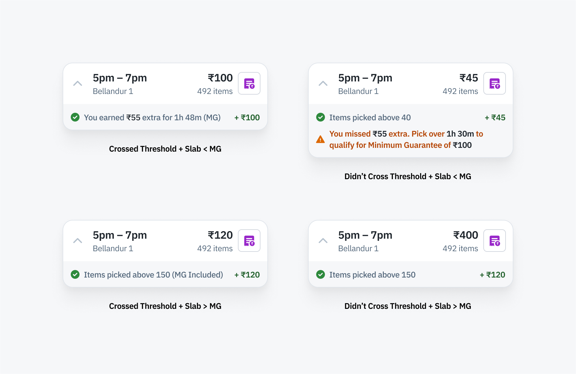
The detailed explanation also works at slot level. These are variants of the slot rows shown in the full daily screen above.
Connecting the result back to the rate
“Show Rates” connected the earnings explanation to the underlying schedule. The full rate card separated item count, the amount added at each level and net earnings. Its under/over-time-threshold control made the effect of qualifying for the guarantee visible in the table itself.
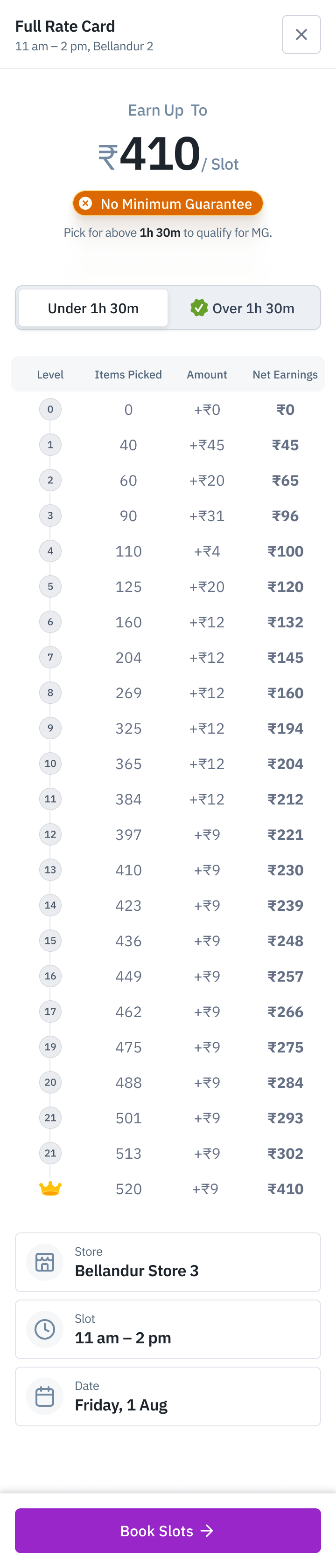
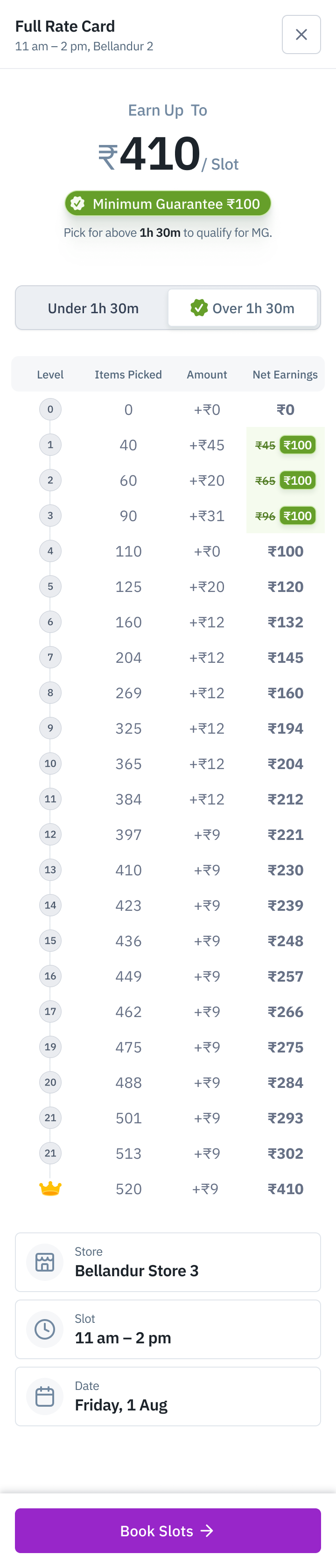
The same rate table in both eligibility states. The guarantee changes the lower earning levels; the highlighted net amounts show where it applies. Each sheet retains the store and slot context and a Book Slots action.
This connected the offer shown before booking to the earnings explanation after a shift. Across the earnings iterations, I kept the amount visible, gave minimum-guarantee eligibility its own explanation, and linked the result to the rate table. The worker could follow an amount from the weekly total down to the slot and its earning conditions.