the last question
Referral tracking and rewards
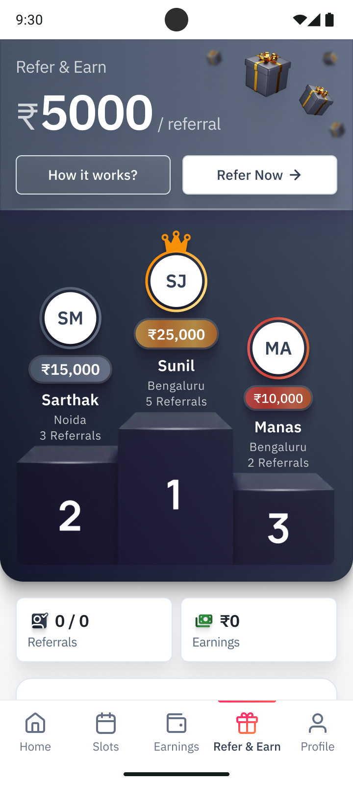
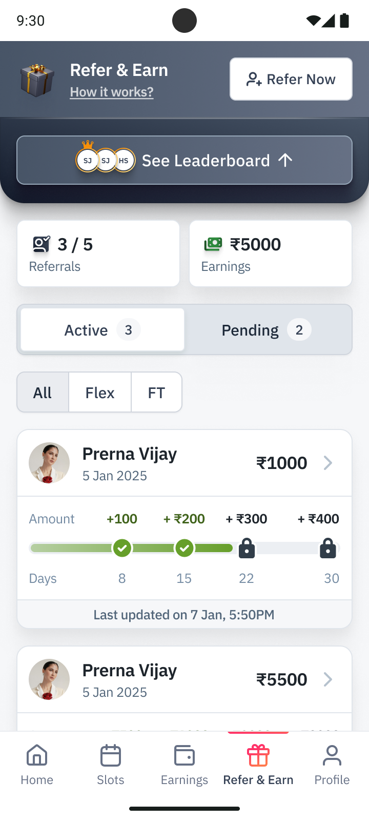
The same screen in two states. Left, the expanded leaderboard. Right, the sticky collapsed header leaves room for the referral list, filters and progress cards.
Images show design versions and explorations. Amounts and dates are example values. Open any image to see it at full size.
The problem
After receiving a referral code, the friend had to complete an application and meet the conditions for a reward. The referrer needed to follow both parts: where the application stood and what counted toward their earnings.
At Zepto, I worked on this experience for people joining as full-time workers or through Flex. The work covered both sides of a referral, from entering a friend’s code during an application to following their progress and earning rewards. It also included the internal tools for setting those rewards.
The rules differed between full-time and Flex work. A reward could depend on the friend’s attendance or order count, the referrer’s own activity, and the store they joined. The interface had to explain those conditions before someone referred a friend, then show what happened afterward.
Working through the design
The designs below show how I worked through the application flow, referral status, reward history and the tools that configured the programme. The different cuts contain alternatives for what to show in a list and what to put inside a referral’s detail view. The state sets cover incomplete applications, missed targets and payment still awaiting credit.
Getting a friend into the application
The onboarding entry flow started with the Packman introduction and earning offer, then phone entry and OTP verification. I worked through the verifying, verified and incorrect-code states before the applicant reached the application.

The sequence in the Referrals file, including the OTP error state. Open the overview to inspect the screens at full size.
The referral code was optional. I kept it separate from the work details and document steps. Someone without a referral could continue through the same application. Someone with one could enter the code in a sheet, see the referrer’s name and edit it before continuing.
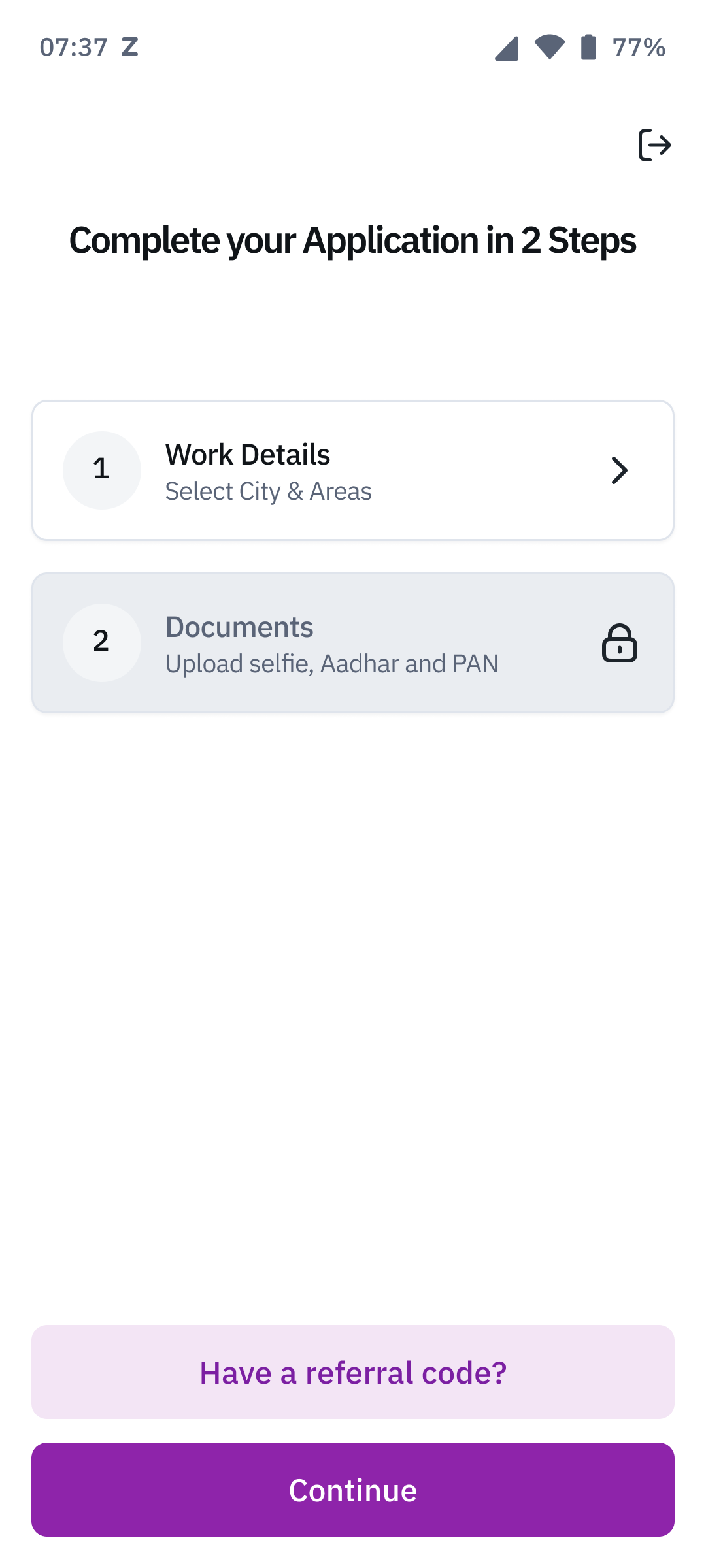
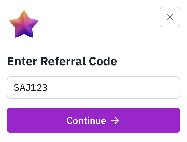
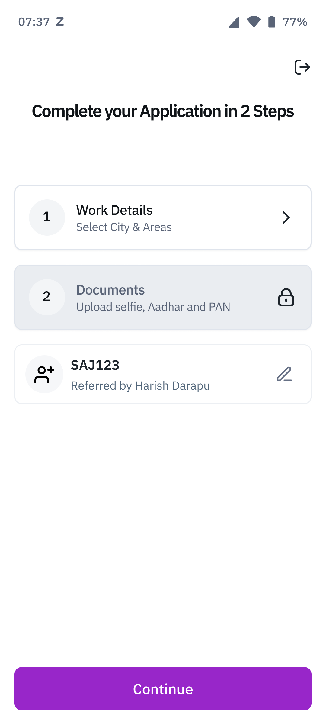
The optional code opens in a sheet. Once accepted, the application shows the referrer’s name and lets the applicant change the code.
What does pending mean?
One draft split referrals into Successful and Pending. The pending list showed names and phone numbers. Another explored a single page with the offer, reward rules, terms and FAQs. These gave different amounts of space to explaining the programme and following an existing referral.
The later status-card designs made pending more specific. A Flex application could be waiting on documents or a contract. Full-time applications also had interview and offer steps. Each needed its own sequence.
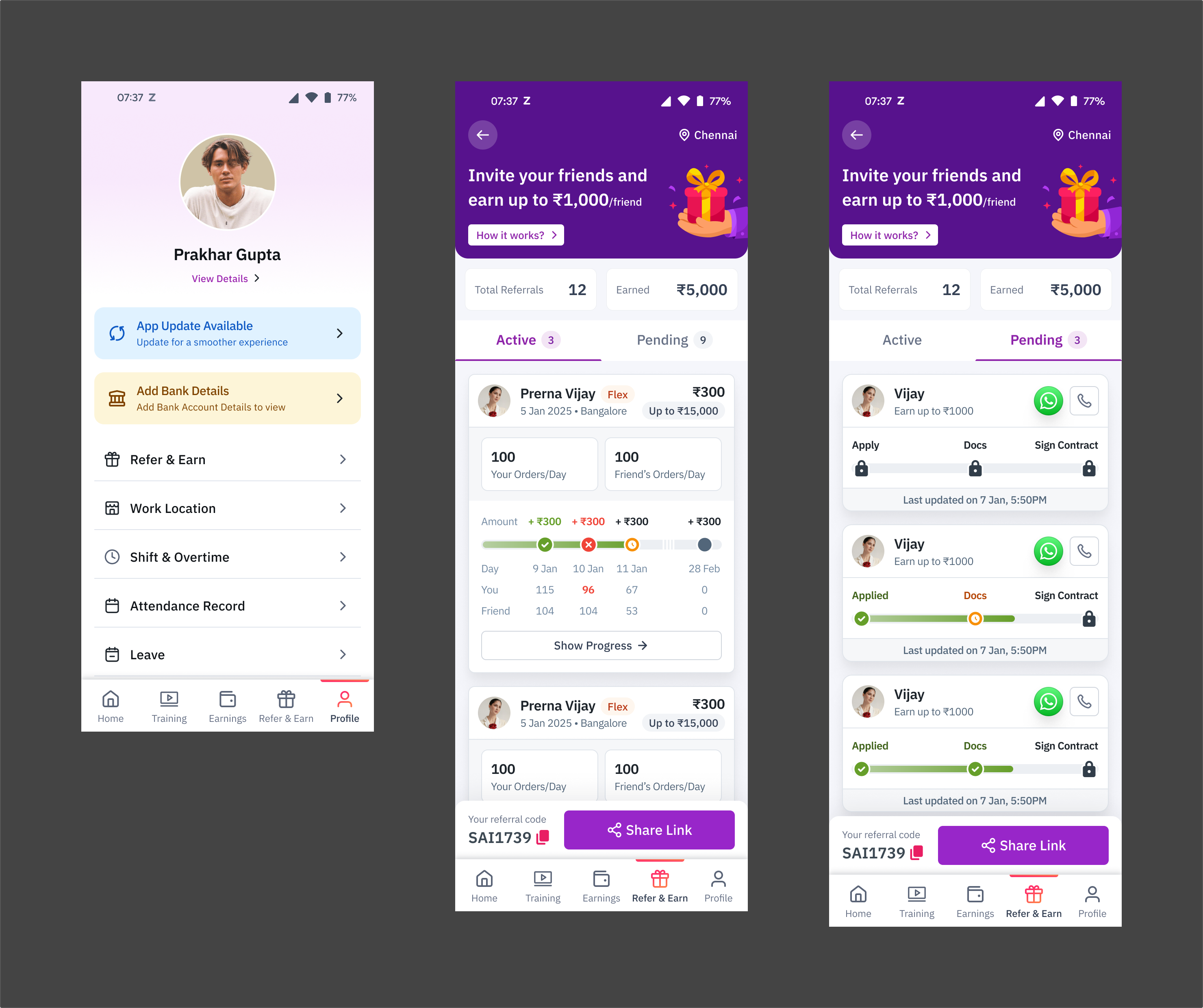
A version from the second cut. Active referrals show work and earnings. Pending referrals show the application steps still ahead.
The component sets covered more than completed steps. They included verification in progress, failed verification, rejection, withdrawal and blacklisting. A timestamp showed when the status had last changed. Phone and WhatsApp actions sat beside the person, so the referrer could contact them from the same card.
A further exploration added an expiry warning and a reminder to help the friend finish onboarding. The card showed which step was holding up the application and when the referral would expire.

The Flex onboarding state set. Waiting, verification and failure have explicit labels, alongside the completed steps.
Explaining the money
Once the friend started working, the information changed. The relevant questions were how much had been earned, what was still possible, and which conditions had not been met.
I explored horizontal checkpoints for this. Each checkpoint could be upcoming, in progress, earned or missed. The daily version showed the date and both people’s order counts beneath the amount.
In one example, the daily target is 100 orders each. The friend has completed 104, but the referrer has completed 96. The reward is marked as missed, and the 96 is highlighted to identify the unmet condition.
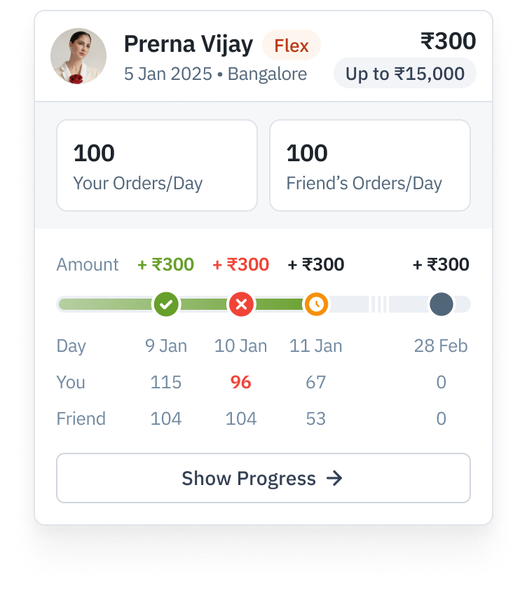
The missed day shows why. The friend’s count is 104, but the referrer’s 96 falls short of the 100-order target shown on the referral card.
The detail view gave this more room. It put possible, missed and earned rewards into a history alongside the application events. It also separated earning a reward from receiving the payment. An earned reward could show when it would be credited, while a paid reward showed its credit date.
The list could stay compact because the explanation was available inside each referral. The detail view retained the activity counts, including the unmet condition on a missed reward.
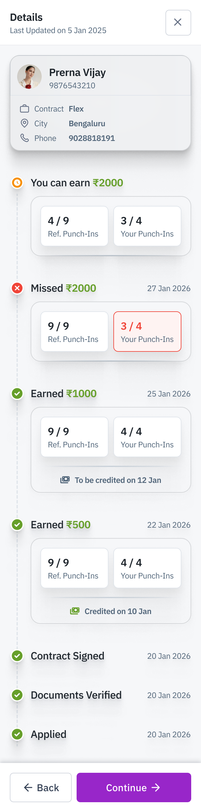
The complete detail view. Possible, missed, earned and credited rewards sit in the same history as the onboarding events. Both people’s activity counts remain visible.
Different offers without different interfaces
The rate-card explorations dealt with offers that varied by location and work type. One version asked the referrer to choose a city before showing its schedule. An alternative put the metro-city and rest-of-India schedules together on the same page.
The store-based version went further. It showed offers for the current store and other stores, with search and city selection. Flex rate cards exposed daily activity requirements. Full-time rate cards separated attendance from the time available to complete it.
I also worked through what happened when there were no nearby stores, no stores in the selected city, or a rate card had not loaded. The loading screen kept a Change Store action available. The empty nearby list pointed toward other stores.
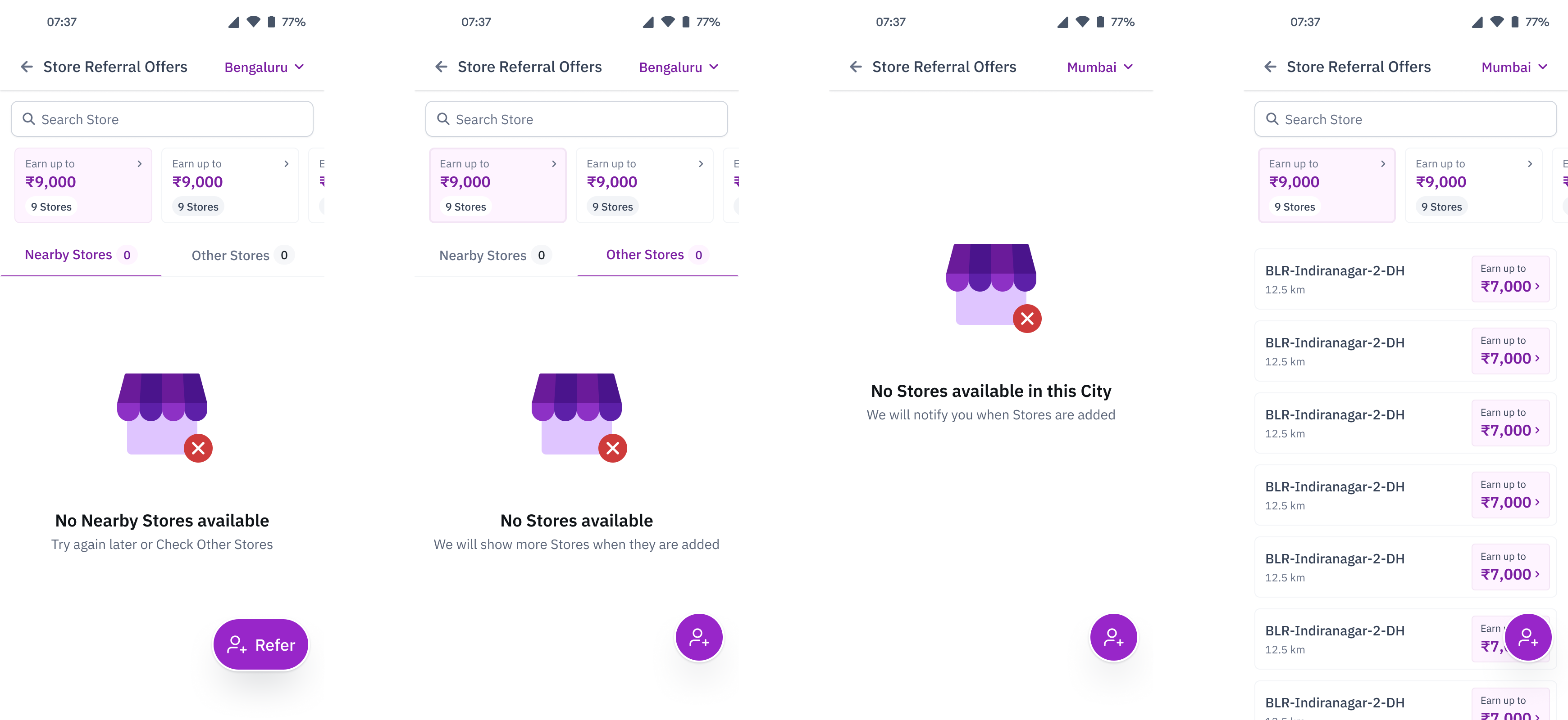
Store availability states from the second cut. The designs distinguish an empty nearby list from a city with no available stores.
Setting the rules
The internal interface let the team create and edit rate cards, give them validity dates, and assign them to cities and stores.
For Flex, the form included the activity metric, daily reward and earning duration. For full-time work, an editor allowed multiple attendance, day and amount slabs. Rows could be added or removed.
The referrer’s condition was configured separately. It could match the friend’s condition or use a different one. That is the other side of the two-count progress display in the app. The team sets a condition here, and the worker needs to understand whether they met it there.
The management table kept the rate-card status, scope and change information visible. The surrounding designs also included bulk upload and filtered reports.
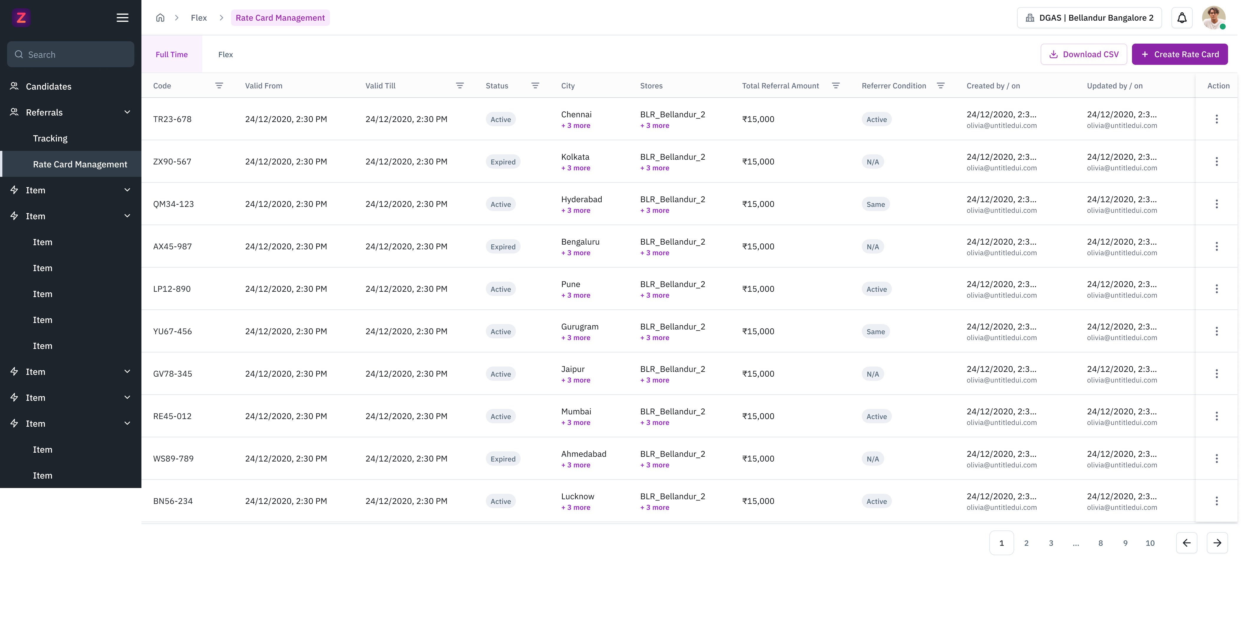
The full-time rate-card dashboard. Each row shows the offer’s validity, status, scope and referral amount, alongside the referrer’s condition and change history.
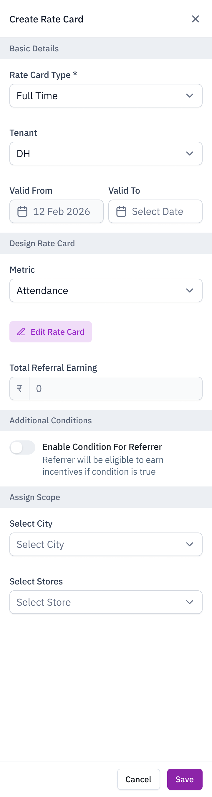
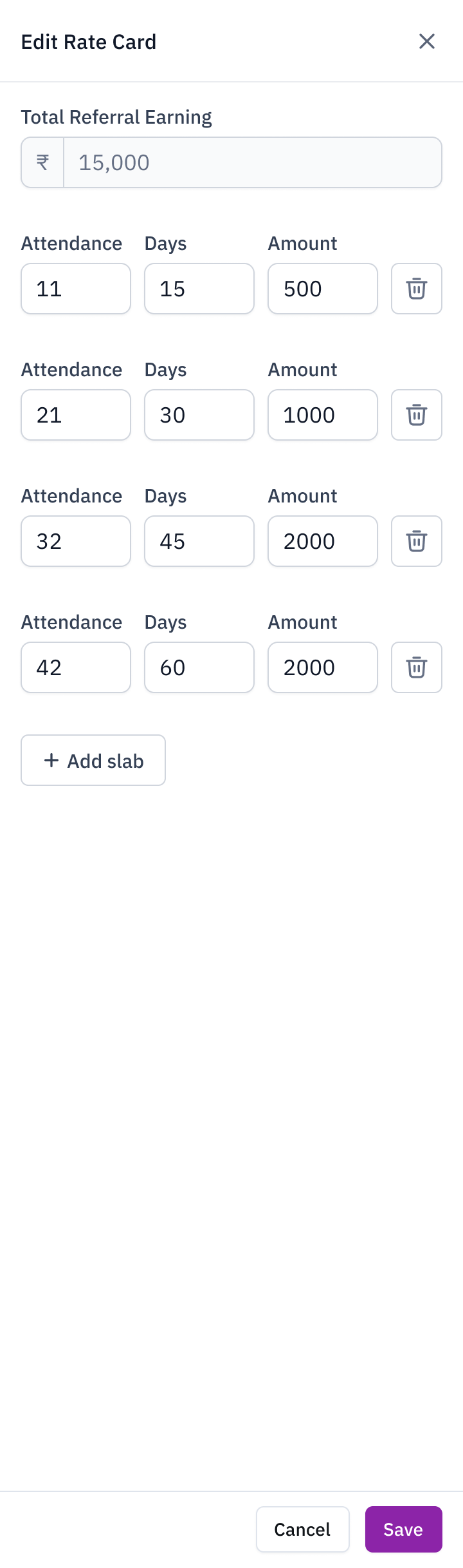
Left, the complete create-rate-card sheet. Its Edit Rate Card action opens the slab editor shown on the right, where attendance, the time allowed and the reward amount are configured together.
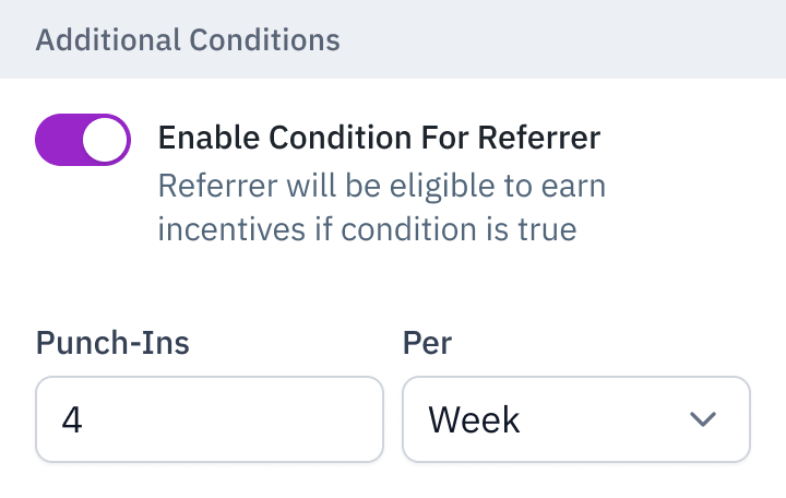
A separate referrer condition in the internal tool. This example requires four punch-ins per week.